Using crop tool to improve composition

Ukai
Often, it is not possible to perfectly compose the photo at the moment of shooting. This is particularly true for action photography, but it is quite common in most real-life situations when we don’t have total control of the model, the background and/or have limited time to take the shot.

Post-processing can dramatically improve a photo, and one adjustment that has the highest impact is cropping. Cropping affects composition, which is the most fundamental element of a picture. It allows us to emphasize the subject and remove non-essential or distracting parts. In Adobe Lightroom, the crop tool located at the very top of tool panel in the “Develop” module. This is not a coincidence. The tools are laid out in the order of the recommended (read: common) post-processing workflow, where the most important, high-impact adjustments are made first.

Recently, I have been taking increasingly more pictures with my iPhone. Before sharing them online, I often make some rough adjustments using the editing mode of the built-in Photos app. Cropping is usually one of them. Here is what I typically do to improve composition:

  1. Straighten horizon.
  2. Cut off unnecessary/distracting elements that do not contribute to the story I am trying to tell in the picture. When in doubt – crop tighter.
  3. Try to use “the rule of thirds” (position the mail element of the picture at the intersection of imaginary vertical and horizontal lines that divide the width and the height of the picture into thirds). for example, in the image above, the face of the fisherman is positioned 1/3 of the frame height from the top of the frame and 1/3 of the frame width from the right side.
  4. Crop the image so that any diagonal lines intersect a corner of the photo – it helps leading the viewer’s eyes into the frame. Again, in the image above, the strings lead from the bottom left corner of the frame towards the middle. Also, the diagonal planks on the hull of the boat lead from the bottom right corner.

Note: It is a good idea to keep these points in mind during the shoot itself to avoid excessive cropping in post-processing, which reduces the number of pixels (i.e. resolution) in the final photo.

Recently, I was taking headshots of the faculty members of my daughter’s dance school for their website, and looked into various ways of cropping the portraits. One rule of thumb for cropping a headshot is that cutting off the top of the model’s head makes the portrait more appealing. It may seem counter-intuitive, but this kind of close crop emphasizes the person’s eyes and make her/him appear engaged with the viewer.

AA5Q6892_09-28-2014-Edit.jpg

At the restaurant: dealing with low-light conditions

AA5Q6094_09-20-2014.jpg


Restaurant is a common setting for a group portrait, because dining out often commemorates a special occasion, as in the photo above – last Saturday we went out to celebrate my wife’s birthday. Using flash is not a good idea for several obvious and not-so-obvious reasons. In addition to disturbing other customers, a flash would completely change the character of the lighting, so capturing the ambiance would be out of the question.

Restaurants are typically dimly lit, so low light performance of the camera is very important. This characteristic cannot be narrowed down to one particular specification. It depends on the lens, the sensor and the firmware. Cell phone cameras cannot compete with DSLRs in this regard, so if you must use a cell phone, the first thing to adjust is your expectations.

If you choose to bring a DSLR, a fast lens (f2.8 or lower) is a must. Also, the lens-camera combination should ideally be relatively compact. In the Canon world, a Canon EF 35mm f/1.4L USM is an excellent lens for this situation. Sigma also makes a good quality 35mm f1.4 lens (Sigma 340101 35mm F1.4 DG HSM), which is quite a bit less expensive. (By the way, these are just recommendations based on my experience, and although the links are affiliated by Amazon, they are not sponsored in any other way). In fact, compactness would be a very good reason to choose a cell phone over a pro camera – after all, it is a dinner first and a photo opportunity second. Having said this, I shot this photo with a Canon EOS-1D X, which is anything but compact. My family is probably getting used to me lugging a huge camera. I’d like to think that the photos are worth it. (Still, I am waiting impatiently for my new iPhone 6 plus, with its image-stabilized camera…)

Here is a roundup of the best cameras for low-light conditions compiled by Adorama (as of Summer 2014). A colleague has recently used their top choice, the Sony Alpha a7S, to photograph a fluorescent helium jet seeded with acetone in near darkness in our lab at UVic. But that hardly qualifies as a common photography situation, so it’s a subject for another story.

As a more general resource for handling low-light situations, check out this book: Chasing the Light: Improving Your Photography with Available Light.

Window light

AA5Q9857_05-25-2014.jpg

Window light is ideal for indoor portrait photography. In fact, some light modifiers (e.g. umbrellas or soft boxes) used in studio lighting setups are designed to replicate this natural lighting condition. There are several good reasons for this.

First, a window is a very large light source, compared to the subject, which results in a diffused, flattering light with soft shadows (smooth transitions between the lighted and shaded areas). A general rule that applies here is this: large light source (e.g. cloudy sky) = soft shadows; small light source (e.g. uncovered light bulb) = harsh shadows.

Second, the colour temperature of the daylight matches that of a daylight-balanced (read: standard) flash, which makes it very easy to use a fill-in flash without having to worry about correcting the skin tones in post-processing. A caveat here is that the shoot is happening close to the middle of the day, not during the “golden hours” around sunrise and sunset that are so desirable for outdoor portraits. So, here is a tip: schedule an indoor photo shoot during the day, if there is an access to a large window.

Third, there is something “right” about the height of the light source represented by a typical window – it is neither too high nor too low to cause unnatural shadow patterns on the subject’s face.

Because of these nice features of window light, I always try to take advantage of it when my daughter is getting ready to go out and is looking out of the window in our hallway. These moments are fleeting, so here is another tip: experiment with camera setting beforehand and save them as a custom preset if your camera allows it. (Here is how to find custom functions in a Canon EOS camera.)

In the photo above, my daughter is going to Raffi‘s concert, and to a dance class in the image below.

AA5Q5987_09-20-2014.jpg

Bling

We started expanding our wedding photography portfolio by taking pictures of rings, graciously provided by Krikor and Marina of Lugaro Jewelry. My original plan was to bring the lights and the diffuser tent to the store, but it became apparent that photographing diamonds requires much more light than could be comfortably accommodated on location.

In fact, at least three lights are needed to capture the brilliant facets of a diamond in colour: a key – highly diffused light, and two additional lights of different intensity. I used an Alien Bees studio flash with a large soft box diffuser, positioned overhead, as the key light, another studio flash without a diffuser on one side and a Canon Speedlite 580EX II on the opposite side. The flashes were optically triggered by another Speedlite (camera-mounted) in a manual mode. Note that E-TTL setting cannot be used on the trigger Speedlite, as it would emit a pre-flash that would cause early triggering of the other lights.

Another point to consider when photographing jewelry or gemstones is textural contrast. Since the objects themselves are highly polished, hard and reflective, using a background that is rough, soft and light-absorbing is a good idea. Of course, rules are made to be broken, so a reflecting background, such as this hand-painted lacquer tray from Kanazawa, can complement the main object nicely.

20140628-004459-2699629.jpg

The biggest challenge, of course, is to come up with an original idea for a photo after seeing hundreds of highly polished, but similar, images in magazine ads. The idea to use a book emerged during the shoot. The book, incidentally is one of the volumes of Pushkin’s letters – a tribute to our heritage and, paraphrasing Obi-Wan Kenobi, a more elegant time.

20140628-004553-2753121.jpg

The most rewarding aspect of this project for me was a chance to do it together with Svetlana, who was involved at all stages. We used to do a lot of photography side-by-side during our travels before Anya was born, but since then, I was doing most of the shooting, and my style, technique and even equipment changed. This time, Anya was in daycare, and we could both focus on the shoot. Perhaps, one day in the future, we will shoot together with Anya?

Feeding seals: timing the shot


Yesterday, we spent a warm and sunny Sunday morning playing at the Willows Beach and feeding seals at the Oak Bay marina. Our daughter has just recovered from a nasty virus that struck half of the children in her daycare group, and my wife and I were just coming down with the same virus – the vicious pattern familiar to many parents of young kids. The weather was beautiful, though, and we really enjoyed the unrushed time together.

At the marina, there are always 3-5 harbor seals waiting for tourists to feed them frozen fish, which can be bought at the souvenir shop for $2.50 per small plastic bag. According to the source that cannot be revealed (Snowden, eat your heart out!), this is, by far, the most popular item at the gift shop. The seals are wild, but they are well-trained in various ways of extorting the treats from people. For example, they appear to know the schedule of the tour buses, they can splash their fins on the surface to attract the crowd’s attention, and they always gather around the dock when a small child appears (as it was in our case).

While the little one was having fun throwing fish to the seals (the closest one got most of it) and my wife was keeping her from joining them in the water, I tried to bait the seals to grab the fish from the side of the dock, while pre-focusing my camera on the fish. I used a Canon EF 35mm f/1.4L USM lens on a Canon EOS-1D X camera body. High framing rate allowed me to get several shots each time a seal would come out to snatch the fish. The depth of field at f1.4 was so shallow that only the seal’s nose came out sharp. The image in this post is at f4.0. In the end, everyone was quite pleased, including the seals (I think).

Sports photography workflow: challenges of forming new habits

In the spirit of making the photos available online almost immediately, Armando and I decided to upload some of the photos to Flickr during the halftime of yesterday’s Whitecaps game, s that they would be available to the media coordinator. During the first half of the game, I shot approximately 1600 images. I took about 9 minutes to import them to Lightroom on a Macbook Pro using a Lexar USB 3.0 card reader. Since I only wanted to select 3 or 4 best images, theoretically, there was more than enough time to select and post them in the remaining 6 minutes of the halftime. However, I found that changing my habitual workflow of culling, or selecting the best images, was not easy. My usual “shotgun” approach is to go through all images in the gallery mode and give one star rating to those that appear to be interesting and technically acceptable (sharp and reasonably exposed). The problem is that what I deem interesting results in about 10% of all images, which means that I would need to look through them again (and sometimes a third time) to further down-select to a set of not merely “interesting” but hopefully unique and generally the best. Clearly, this two- or three-stage process is not time efficient when only 3 images are needed to begin with. The only logical conclusion is the one needs to relax the quality of the selection process, i.e. accept the fact that the selected 3 images (which, by the way, must be determined in a single pass) might not be the best of the entire set. Basically, the timing of delivery of the images must take priority over the quality of the delivered photos. This is difficult to come to terms with, because from the artistic standpoint, we are emotionally attached to the photos we’ve just taken and intuitively want to show off the best of them. Here, the professional side of being a photographer must come into play. What helps me rationalize the process is that I know that the “best” images are still there, waiting in the Lightroom catalogue, which I will have other opportunities to review, hopefully, without the time pressure.

Action photography: autofocus speed


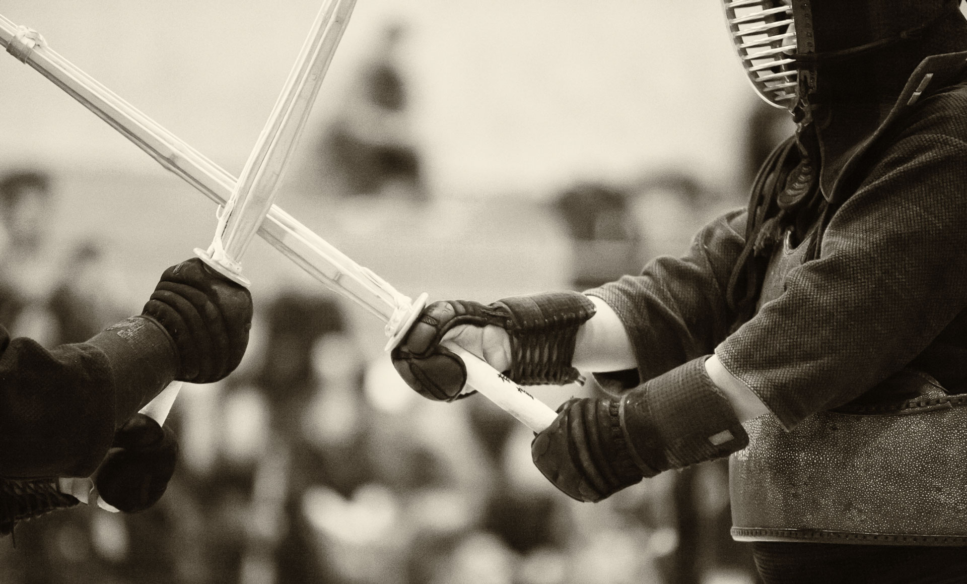
This is one of the first action shoots with my new Canon EOS-1D X. On February 8, I went to Steveston kendo taikai – the largest kendo tournament in North America. Being quickly eliminated from the tournament ladder myself provided opportunities for shooting. (One needs to find positive in everything, they say… One day, mind will prevail over matter… one day!) Needless to say, the autofocus speed was unbelievable, compared to a 5D Mark II, and so was low light performance. The focussing speed depends a lot on the lens, of course.

I borrowed a Canon EF 85mm f1.2L II USM lens for that day, but I already knew that it was very unforgiving. One really needs to practice following the subject and anticipating the action, and even then, some missed shots are expected. It’s all worth it, though, as the shallow depth of field of this lens is unmistakeable and very appealing.

For more examples of photos taken with a Canon EF 85mm f1.2L II USM lens see these galleries of a rock performance and an indoor rowing competition.

At the playground

Waiting for the ferry on the way to Whistler, I took a few shots of our daughter climbing about at a playground in her bulky but colourful whiter clothes. Trying to avoid the ordinary (read: “boring”) look of playground snapshots, I aimed for a very shallow depth of field (DOF) using a Canon EF 35mm f/1.4L USM lens. This lens has recently became my main walk-around lens, replacing a Canon EF 24-105mm f/4 L IS USM in this role. At first I was skeptical – I thought that if I would be limited to a single focal length, all photos from that shoot would look largely the same. However, I now think that shallow DOF provided by f 1.4 compensates for the absence of zoom, and the images actually look more interesting than those taken at f4. I am beginning to agree with a friend of mine, who said that if an image does not have a shallow DOF it does not look “special” (his background is in portrait photography; this does not apply apply to landscape, for example).

How to photograph (and be photographed in) a group portrait: on cooperation and interference

No wedding, reunion or other event that involves gathering of friends and relatives is complete without a group photo. Here are some thoughts on how to photograph and be photographed in such situation.

Tip #1: Avoid interference from other photographers.

If there is more than one photographer taking pictures of the group, it is helpful to communicate to everyone, who the main shooter is at any given time, so that everyone is looking in the right direction. Here is an example from a very fun and relaxed wedding photo shoot a couple of weeks ago. Armando and I were taking pictures at the same time, but we explicitly asked everyone in the group to look only at Armando, so that he would take a more traditional shot, while I would try to capture candid moments as they were setting up.

Tip #2: Make sure you can see the camera.

If you are standing/sitting/laying behind other people and cannot see the camera, you won’t show up in the picture. A careful photographer would notice this and ask you to re-position yourself.

Tip #3: Mind the dynamic range.

If the photo is taken outdoors, the first thing to do, as far as exposure is concerned, is to “get to neutral”, according to the excellent advice of Jim Harmer of Improve Photography. This means avoiding sharp shadows and highlights on the faces. Bring the entire group into the shade or, if that is not possible, have them face away from the sun. (yes, do shoot against the sun! … just try to avoid the lens flare – make sure that the front element of the lens is in the shade).

Tip #4: Mind the depth of field.

The depth of field in the group shot should be larger than that in an individual portrait (so that everyone is in focus, of course). It is also helpful if the group is not spread too much front-to-back.

Tip #5: Take several shots using continuous drive.

In case someone blinks, you would be able to photoshop them in from another frame.

Image post-processing: preserving bokeh while enhancing detail of the subject

Adjustment points in advanced editing software, such as Nick Collection, for example, can be very effective for applying certain effects, such as enhancing contrast or structural detail, to a localized part of the image. However, sometimes the algorithm becomes confused, and the effects spill outside of the intended areas. In my experience, this often adds unwanted grain and other artefacts to the nice background blur (bokeh) created by fast lenses (low f-numbers).

Here is a simple Photoshop workflow to preserve the bokeh while applying the effects to the subject:

1. Open the image in Photoshop.
2. Create a copy of the background layer. It will become the top layer.
3. Apply the desired effects to the top layer.
4. Create a layer mask for the top layer and fill it with black colour. This will hide the layer with the applied effects.
5. Using a brush tool and white colour, paint the areas that should show the applied effects on the layer mask. This will reveal the effects in the areas that are painted white.
6. Save changes and close the file.

I used the above procedure on this image of cherry blossoms on Moss Street in Victoria, BC. I applied Nick’s “tonal contrast” and “structure” filters to the flowers that are in focus, but left the blurred-out areas untouched.