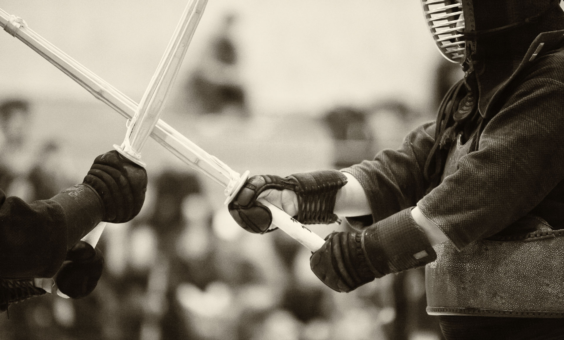
Being engaged in the action: difference between professional and amateur photographers

Rock!

The main difference between sports, travel and event photographs shot by professionals and amateurs is the degree of involvement of the photographer in the action. When I started taking photographs of festivals, sporting events and people in the streets, my subconscious desire was to be a “fly on the wall.” I wanted to convey in my photographs a sense of the action without disturbing the participants or being engaged in the event myself. As I kept shooting this way, my technical skills grew, but it became apparent that it was the non-participant’s mindset that was limiting my progress.

Gradually, I became more comfortable becoming more actively engaged in the action that I was shooting. Part of this is just technique. For example, it is often taught that in order to take better photos of playing children, the photographer needs to get to their level – lay on the floor or on the ground. However, a large part of this approach is mental attitude. If you enjoy the event itself, this notion will be conveyed in the photos, and the way to enjoy the action is to be genuinely interested in it and to interact with the other participants.

This active approach to photography, which distinguishes professionals from many amateurs, is a skill, and as such, it require practice to develop. (I hesitate to say “to master”, because from my experience in kendo, I have yet to see a limit to a particular skill that would qualify as “mastery” – there is always room for improvement.)
More photos on Flickr: http://ow.ly/xvxoDComplete set: http://ow.ly/xvxro

So what does it take in practical terms to take photos that convey engagement with the subject?

  • First, it means getting close to the subject. This implies genuine interaction, often with eye contact. There is no way to fake it.
  • Second, I take my best photos when I know the subject well. Again, this means genuine interest.
  • I try to take opportunities to shoot in difficult conditions in terms of weather or lighting. Doing so conveys willingness to share the challenging conditions with the participants of the game, event, etc.
  • To shoot in challenging conditions, I use professional-level gear (Canon EOS-1D X camera and L-series lenses, for example, a rugged and “fast” Canon EF 70-200mm f/2.8L IS USM).
  • Finally, there is a real advantage of actually being a professional. A media pass to an official event provides access to shooting positions and locations that are simply not accessible to the general public. So, what to do if you are attending an event as a spectator? Shoot what you can most easily relate to – other spectators, the setting,… convey the sense of your experience. And get to know the players/actors/organizers – this can lead to getting your own media pass for the next time!

AA5Q9249_10-04-2014.jpg

Selecting autofocus point for soccer photography

AA5Q9966_10-25-2014.jpg

My default autofocus point selection for shooting sports is the central one, because it is the most precise sensor that is able to detect contrast gradients in the horizontal, vertical, and diagonal directions (I am using a Canon EOS-1D X, but this applies to any DSLR, since the central autofocus point is typically the most precise one, regardless of the specific technology).

When shooting soccer games, I sometimes switch to the bottom point to capture the moment when the players jump to receive a high-flying ball with their heads. When I anticipate such moment, for example, when a goalie kicks the ball into the field, I quickly switch the autofocus sensor to the bottom one. I have the sensor selection assigned to the joystick on the back of the 1D X, and one neat feature of this control assignment (which is customizable in this camera) is that pressing down on the centre of the joystick returns the focus selector to the previously used position. I also assign separate default sensors to the landscape and the portrait orientation of the camera (my default for the vertical orientation is the bottom sensor to capture the jumps).

On the other hand, when the action comes closer, I switch to the top autofocus point to focus on the faces of the players.
AA5Q1133_10-26-2014.jpg

Making math look good: advertisement photoshoot for a calculus course

Problem solving

Last summer, my wife was involved in designing a short course in calculus for incoming first-year students at UVic. To help promote this course, we set up a staged photoshoot with current students and instructors as models. Armando and I set up the lighting (studio strobes with softboxes and umbrellas) in the actual classroom where the course would be taught. We had a relatively short shooting list: couple of shots of individual students writing on the board, a group portrait of them having a conversation in front of the board with formulae written on it, and a group portrait of the students talking to the instructor.

The key image, shown above, is a composite of two photos: a shot of the student pretending to be writing (he was holding the marker in mid-air) and a shot of the math formulae written on a white board with a blue marker.

Here is how I made it:

  • Opened both photos in the same Photoshop document: the portrait on the background layer and the shot of the board on the layer above it.
  • Created a Curves adjustment layer above the top layer.
  • Clipped the adjustment layer to the layer below it. To do it, I clicked the left-most icon at the bottom of the Curves menu, which looks like a square with an arrow pointing down. This makes the adjustment layer affect only the layer immediately below it, not all underlying layers.

Screenshot 2014-10-24 22.26.46

  • Increased the exposure (by dragging the midpoint of the curve in the layer menu upwards). The purpose of this is to over-expose the image of the white board, so that everything, except the text, becomes solid white.
  • Selected the layer with the board image, and clicked on the white colour with the magic wand selection tool (activated by pressing W). I held Shift key and click inside all areas enclosed by the blue lines, such as the areas inside the loops of 6’s. This created a mask containing everything, except the blue text.
  • Pressed Delete key. This removed the white board and left only the blue text.
  • Removed the selection by going to Select > Deselect in the top menu bar (or pressing Command-D).
  • Selected everything in the layer (i.e. the text) by going to Select > All (or pressing Command-A).
  • Went to Edit > Transform >Flip horizontal to create a mirror image of the text.
  • Selected the move tool (by pressing V) and dragged the image of the inverted text to align it with the marker in the student’s hand.
  • That’s it! I saved the  Photoshop document to preserve the layers. The flattened composite image can be saved in any format afterwards as a copy.

AA5Q9271_06-19-2014-Edit.jpg

Close-quarters shooting using a fisheye lens

untitledAA5Q6565_09-26-14.jpg

As a part of collaborative research of hybrid-powered ships, my colleagues and I recently visited the first diesel-electric vessel in the BC Ferries fleet, M.V. Tachek, which operates between Quadra Island and Cortes Island. I new that we would have an opportunity to visit the machine compartment, among other areas that are normally restricted to passengers, so I wanted to photograph them to document the site visit and to promote this research project on the web.

I expected to shoot in a highly-confined environment with poor lighting, so I packed my Canon EOS-1D X DSLR, which has remarkable low-light performance, and fast lenses (35mm f/1.4L USM for extremely low light and 16-35mm f/2.8L USM for extremely tight quarters).

untitledAA5Q6441_09-26-14.jpg

Also, Armando lended me his Canon EF 15mm f/2.8 Fisheye lens, pointing out that it would be better for photographing people than the 16-35mm f/2.8L. He was absolutely right. Of course, the fisheye creates a lot of distortion, but this distortion is of a different kind, compared to that of a rectilinear lens, such as the 16-35mm f/2.8L. Since a rectilinear lens is designed to preserve straightness of straight lines, objects near the edge of the frame appear to be stretched and enlarged, which is not flattering to human faces. On the other hand, a fisheye lens covers the 180° field of view by reducing the scale of objects towards the edge of the frame. It also does not preserve straight lines, but since a human face does not contain many straight lines, this is typically not a problem.

As it turned out, the machine compartment of the Tachek was more spacious than I thought, but the fisheye lens produced fun images with a unique perspective.

untitledAA5Q6720_09-26-14.jpg

Here are some tips for using a fisheye lens:

  • Compose a portrait so that the face of the subject is located close to the middle of the frame to minimize distortion.
  • If there is a horizon line, place it so that it crosses the centre of the frame – this way, it will not be distorted.
  • In many situations, such as sports or other action, for example, it is a good idea to switch the lens to manual focus and manually focus just short of infinity. Because ultra-wide angle lenses have huge depth of field, compared to normal or telephoto lenses at the same f-numbers, almost everything in the frame is going to be in focus all the time, regardless of there the focussing point of the camera points to. Turning off autofocus can maximize the framing rate, particularly in low light situations.

Converting a noisy photo to black-and-white

AA5Q9797_02-10-2014-Edit.jpg

I wrote in another post about reducing noise in low-light photos, but sometimes the amount of the recorded light is just too low to yield adequate results. Suppressing the noise in those situations would lead to the loss of details that would not be acceptable. I particularly dislike colour noise – random occurrence of alternating red, green and blue pixels in close proximity to each other.

Sometimes, a very noisy image can be salvaged by converting it to black-and-white. The reason why the resulting monochromatic image looks better than the original is that the colour noise now appears as luminance noise. In other words, there is no longer a visible variation in the colour of the neighbouring pixels – just in their brightness.

Another important advantage of black-and-white conversion for low-light photos is that a monochromatic image would actually show more detail than the colour one. This is because all three RGB channels (red, green and blue) are now contributing information about the contrast and brightness gradients that can be perceived visually. In an extremely low-lit scene, such information is very limited, and any single colour channel might not carry sufficient amounts of it to be processed by human brain. Incidentally, this is why we see night scenes  mostly in black-and-white. Any colours that we do perceive at night are either very desaturated or actually produced by our brains based on our prior experiences of adequately-lit objects.

Finally, noise in black-and-white images is more acceptable than in colour ones, because digital noise looks like physical grain in black-and-white film emulsion, which is associated with fine art images. In fact, there are many plug-ins for Adobe Photoshop, for example, that simulate various film grains.

AA5Q0446_02-10-2014-Edit.jpg


How to convert a photo to black-and-white

There are many ways of doing the actual conversion, but perhaps the most important this to remember is that it is more than simply desaturating the colour.

Using a channel mixer (go to Image > Adjustments > Channel Mixer and click the “Monochrome” box at the bottom of the menu) provides great control, but is a bit difficult to master due to a large number of possible adjustments.

Personally, I use a packaged solution – a Nick Collection module called Silver Efex Pro. I usually start with one of the provided presets and adst some parameters slightly, while watching the preview. My favourite presents are “High structure,” “Full dynamic range” and “Film noir.” I rarely use the image in the form it comes out of the preset, because the adjustments do not work equally well for all elements of the photo. I either modify the effect using control points within the Silver Efex, or make several layers in Photoshop, each containing a different effect, and then masking portions of each layer as appropriate. This, by the way, is a general rule for avoiding a cookie-cutter, Instagram-filter-like effect – a post processing effect needs to be applied to parts of the photo selectively.

AA5Q3069_10-11-2014-Edit.jpg

Best walkaround lens for a Canon DSLR

PO-IMG_5810_06-15-13-Edit.jpg


When Canon 5D Mark II  came out, the camera was available as a kit, bundled with a 24-105mm f/4L IS USM lens. I really liked the lens, and for a long time, it was my favourite walkaround lens – something than can work in most everyday situations. I shot landscapes, street travel photos and family portraits with it.

The problem is that while the 24-105mm f/4L works well for almost everything, it is also not particularly spectacular in any given situation. It is, basically, a compromise, albeit a very good one.

The wide end of the zoom range (24 mm) is not wide enough for creating really unusual perspective of confined spaces and wrapping the view around corners, which works well for closeups of architectural details (the Canon EF 16-35mm f/2.8L II USM or the Canon EF 8-15mm f/4L Fisheye USM are better for these types of shots). The 104 mm focal distance is also not long enough for compressing perspective and isolating far-away details of landscapes (the Canon EF 70-200mm f/2.8L II IS USM is better for this, although it is quite a bit more expensive).

Also, the maximum aperture of f4 is Ok, but not fantastic in terms of bokeh and simply does not gather enough light for indoor sports or concert photography.

PO-IMG_5623_06-13-13-Edit.jpg


Currently, my favourite walkaround lens is Canon EF 35mm f/1.4L USM. (The photos in this post are taken with this lens.) It may seem less flexible than the 24-105mm f/4L, but in reality, it is not so. I find the 35 mm focal lens ideal for portraits and street photos. I need to get very close to the subjects for an interesting composition, though. The sharpness is superb. The wide aperture allows shooting in near darkness with a modern DSLR and produces very pleasing bokeh and subject isolation.

There are a few challenges, of course. The fixed focal length (lack of zoom) means less flexibility with composition. To complicate this aspect further, if you are shooting wide open, at f1.4 (and why wouldn’t you? After all, this is the main feature of this lens!), the depth of field is so shallow that you cannot half-press the stutter button to focus on the subject and then re-compose the shot, as slightest change in the angle of the camera after focus has been obtained will cause a blurry image. It took me quite a while to get used to, but with practice, getting close to the subjects, placing a focus marker exactly on the subject’s front eye and not re-composing became second nature.

AA5Q3222_10-11-2014.jpg


The super-wide maximum aperture is really the key feature, and not only for light-gathering capacity, but mostly for the incredibly shallow depth of field it produces. The ability to isolate the subject in almost any situation is what often makes the difference between an artistic photo and a snapshot. I really appreciated it during our recent trip to Disneyland.

Basically, the 35mm f/1.4L makes no compromises, and is unforgiving because of this. But for the same reason, it can produce unique images.

Shooting field hockey: best lens and camera position

More photos here: http://ow.ly/CEMyg


I was taking photos of our university’s women’s field hockey game last two weekends, and as an experiment, I shot each of them with a different lens.

Shooting field hockey is challenging for couple of reasons. First, the field is relatively small and it is enclosed by a fence, so on one hand, the action can come very close to the camera very quickly, and on the other hand, it is difficult to isolate the players from the background if they are at the opposite end of the field from the camera.

The second challenge is that the players are crouched down while fighting to control the ball, so if the light is harsh, as the daytime sunlight often is, the players’ faces are covered by deep shadows.

Third, the colour of the artificial turf is bright green, which creates an unpleasant cast on the faces of the players, as they bend down, looking at the ball.

The first challenge of the wide range of distances from the action can be overcome by using an appropriate lens. I shot my first game of this season with a Canon EF 70-200mm f/2.8L IS USM. I has a good zoom range, which is great to have when the action is close, it focuses very fast and it is relatively light. I had the lens mounted on a Canon EOS-1D X and carried it on a Y-strap. It was so easy to handle that I was convinced that if I had a single lens to choose, the 70-200mm f/2.8L would be it. Its only drawback is insufficient focal length for far-away shots, such as action at the opposite end of the field and close-up shots of the players celebrating the goals.

More photos here: http://ow.ly/CEDsM


The next game, one week later, I shot with a Canon EF 300mm f/2.8L IS USM lens, and the success rate of interesting shots was much higher than I expected. In fact, I had to revise my opinion on what would be a single go-to lens for field hockey. The 300mm f/2.8L is at least a very close contender, if not the winner of that title, in my opinion. There are a couple of disadvantages of this lens: fixed focal length and weight. Both are manageable, though. The challenges in composing shots due to the absence of zoom can be overcome with practice. It took me about one season of shooting to become comfortable with the 300mm. I must add that I am deeply grateful to Armando, who gave me a free run of using his lens, for making this experience possible. The weight of the lens is also not prohibitive for using it hand-held. More importantly, I believe the interesting shots 300mm f/2.8L produces are worth the inconveniences.

To handle the lighting, I think the best angles with respect to the sun are either direct light, where the sun is behind the camera, or backlight, where the sun is behind the subject. The direct light is a bit flat, but produces bright, saturated colours of the players’ uniforms. The backlight produces low contrast and saturation, but creates very pleasant rim light effect on the hair of the players.

Note: The artificial turf is soaked with water before each game, so when its surface is struck with a stick, or even with players feet, a spare of small water droplets is produced. To capture it, a fast shutter speed (minimum of 1/1000 sec) works best. Also, the spray looks very nice when backlit.

Sport photography: noise reduction in post-processing

AA5Q1832_10-04-2014.jpg


Sports photography often requires very fast shutter speeds in order to freeze the action. In my experience, a minimum of 1/800 sec is required for basketball or soccer. My typical setting, which I save as a custom function in the camera is 1/1000 sec. Since lighting is often quite dim, particularly during indoor events or night games, fast shutter speeds require very high ISO settings, even with “fast” lenses (i.e. lenses that have large maximum aperture). As a result, the images become quite noisy, even when shot with state-of-the-art cameras, such as Canon EOS 5D Mark III or Canon EOS-1D X (in the Nikon world, there are counterparts such as Nikon D800 and Nikon D4S).

Noise becomes more noticeable when viewed at high magnification as random variations in brightness and colour between neighbouring pixels. These variations can be smoothed out in post-processing using fairly sophisticated algorithms implemented in various image-editing software. However, ultimately, this noise reduction causes loss of detail, which appears as lack of sharpness.

The good news is that in sports photography, relatively high levels of noise are considered acceptable. In fact, certain amount of noise adds character to the photo and conveys the sense of extreme effort exerted by the athletes.

Also, noise reduction is not nearly as destructive to the sharpness of the photo if the image is down-sampled (reduced in size) to be shown as a thumbnail on screen, for example. The counter-intuitive fact is that when the size (in pixels) of an image is reduced, the apparent sharpness is increased. This is because the small details that are lost due to noise reduction processing would not be visible anyway in the small image, so it appears both sharp and with low noise. The same is not true about the noise level, however. When the image size is reduced, the apparent noise is at best appears the same and often looks more pronounced than in the original, high-resolution photo.

Here are my typical strategy for noise reduction in Adobe Photoshop Lightroom, where I do most my post-processing. The Noise Reduction panel of the Develop module offers separate control of two main types of noise: Luminance and Color. Each of those has additional aspects, which can also be controlled separately (detail and contrast for Luminance and detail and smoothness for Color), but I almost never use them. I find the colour noise more unpleasant than the luminance noise, but it is also better controlled by the camera, so I rarely have to correct for it. I only work with Luminance slider for most of my photos.

  • If the noise level is relatively low, I find that Luminance settings between 0 and 10 (in some arbitrary units used by Lightroom – they are really just relative indicators of the amount of noise reduction applied) do not cause visible loss of sharpness.
  • If the noise is extreme, I set Luminance to around 30 and sometimes up to 50. Above that, the loss of detail is quite severe, and would be noticeable if the image is reduced in size.

More photos here: http://ow.ly/Ci0o7

Image editing: an easy way of applying adjustments to a selected area

AA5Q7015_05-14-2014-Edit.jpg


One of the most basic, but most useful techniques that I use in Adobe Photoshop is applying an adjustment only to a part of the photo. There are many different ways of doing this, but the procedure described below bypasses a tedious selection of of the small details of the area that needs to be adjusted.

Let’s consider the photo of the young dancer above as an example. Suppose that we want to increase the exposure of the girl, but leave the background as is. Note that increasing the exposure here is just an example of an effect. Similar things can be done with saturation, contrast, blur or other effects. The point is to show how to apply the effect selectively. Here is the set-by-step procedure:

1. Open the file on Photoshop. The image will be place on the background layer of the Photoshop document (as shown in the Layers panel at the bottom right of the Photoshop window).

Screenshot 2014-10-15 22.30.34


3. In the Curves Properties window that appears, click in the middle of the curve and drag the handle that appears upward. This makes the entire image lighter, but at this point, consider only the dancer’s figure and mentally ignore the background – it will be excluded later. Also, you don’t have to be very precise with the degree of the adjustment either – it can be easily tweaked later (see step 7).

Screenshot 2014-10-15 23.07.37


4. Select the layer mask of the curves layer and press CTRL-I. This fills the layer mask of the Curves layer with black colour, hiding all adjustments.

Screenshot 2014-10-15 23.28.18


5. Select a soft round brush bush and with the layer mask selected paint with white colour, revealing the areas that are supposed to be affected by the Curves adjustment.

Couple of notes:

  • I use a pressure-sensitive Wacom Intuos Pro graphics tablet for these edits – it makes an enormous difference compared to using a mouse. In fact, I would not attempt this with a mouse, unless there would be no tablet available.
  • There is a very useful keyboard shortcut for changing size and hardness of the brush: With the brush tool active, press Shift-Option (or Alt)-Control and drag left-to-right to adjust size or drag top-to-bottow to adjust hardness. A red image of the brush will appear to serve as a visual guide for these adjustments.
  • There is no need to be very precise at this step. If you paint part of the background next to the girl, just ignore it – it will be taken care of at the next step. If you make an obvious huge mistake, paint the area black to hide the Curves adjustments there.

6. Now, the roughly painted-in selection can be refined in one easy step. There is no need to spend time selecting every individual hair around the dancer’s head, etc.

Instead, Double-click on the Curves adjustment layer anywhere to right of the layer mask. This opens a Layer Style menu.

At the very bottom, where it says “Underlying Layer”, press Alt (or Option) and click on the left (black) handle. This slits the handle in half; drag the right half to the right while observing the effect of the photo. Doing so makes the the Curves adjustment layer visible only in the areas where the underlying layer is brighter. Incidentally, if you Alt (Option)-click the right (fray) handle and drag one half of it to the left, you make the adjustment layer visible in the areas where the underlying layer is lighter. Once you’ve adjusted the slider position(s) to achieve the desired effect, click “Ok” in the Layer Style menu.

Screenshot 2014-10-15 23.57.12


7. If the adjustment is too strong, it can be tweaked again in theCurves Properties menu – you can open it by double-clicking the Curves adjustment layer just to the right of the visibility icon, which looks like an eye. Alternatively, you can adjust the opacity of the entire adjustment layer to mute its effect.

Screenshot 2014-10-16 00.20.11


8. This is it! Go to File > Save as… and save the file in a format that you need.

On imperfect conditions

PO-IMG_2089_12-07-13.jpg

“It is, after all, the dab of grit that seeps into an oyster’s shell that makes the pearl, not pearl-making seminars with other oysters.”

– Stephen King, “On Writing.”

I wrote in this earlier post on waterproof gear that bad weather often makes good photos. In fact, incorporating weather (read:bad weather, form a conventional viewpoint) in a photo is almost a requirement in some genres of modern photography. Indeed, Ansel Adams is arguably the most famous photographer ever mostly because he was ahead of his time by using weather elements in his landscapes. Nowadays, every landscape photographer does it.

However, it is not just imperfect weather conditions that promote creativity. Other challenges are also very effective in developing a photographer’s skill. For example, shooting in low light is challenging, but the results are usually worth the effort.

5D_MG_1688_06-04-10-Edit.jpg


Likewise, shooting sports action is difficult because of the fast, unpredictable movement of the athletes, lack of control over light, etc. For a while, I was using a Canon EOS 5D Mark II as my main camera and felt that the low framing rate and slow autofocus were really limiting the success rate of my shots. After upgrading to the unbelievably fast Canon EOS-1D X , I can definitely say that my experience with the 5d Mark II was very valuable, as it taught me to determine the characteristic moments of the action, whether it is basketball, soccer, rugby or swimming. If I didn’t have the sense of those decisive, characteristic moments for each sport, it would have been tempting to just let the 1Dx rip at 12 frames per second from the beginning of each play until the end. This would have left me with tens of thousands of poor images, among which it would have been impossible to find a single good one, that would tell the story of the game.

More photos here: http://ow.ly/Ci0o7


So in order to improve at photography, I try to:

  • Shoot challenging subjects;
  • Shoot in difficult light and poor weather;
  • Practice with whatever gear we have to find out the limits of a particular piece of equipment – it makes the new gear, when it becomes available, much more effective.