Headshots using window light

AA5Q1186_07-08-2014-Edit.jpg
I am planning to take headshots of colleagues from the Mathematics department for their website. My wife, who works there, and I met for lunch and explored possible locations and settings for the photo shoot.

The math building has huge windows that spans the entire wall facing the courtyard. Since the shoot will happen during daytime, I want to use this window as the main light source for the photos. Since the window is very large compared to the subject (a statistically-average math professor), the lighting that the window casts on the subject is very “soft”, i.e. the transitions between the light and the shadows are very gradual, which is typically flattering to the above-mentioned math prof (or any typical human being, for that matter.) I will use a white plastic card sticking out from an on-camera flash to create a catchlight in the subject’s eyes. This also has an added benefit of slightly filling in the shadows on the side of the face opposite from the window. Combining flash with window light is not an issue from colour-matching standpoint, since the flash is daylight-balanced.

I plan to use the Canon EF 70-200mm f/2.8L IS II USM lens on a Canon EOS-1D X body. The longer the focal length, the less prominent the protruding facial features (read: nose) appear in the photo, which, again, makes the statistically-average math professor appear more photogenic and more closely approaching the unrealistic standard of human beauty perpetuated by professional models.

I plan to shoot wide open, at f/2.8, or maybe slightly stopped down in order to blur the background, which will be just the interior of the mathematics building. I do not want to set up a paper or fabric background, since there are several alternatives offered by the interior itself: an abstract, brightly-colored mural (the window would provide a frontal light in this case – the easiest setup), a grey-coloured staircase receding into the distance (subject facing sideways from the window – the best background colour and most artistic lighting) or the exterior courtyard (subject facing mostly away from the window – nice edge light in this case, but a lot of fill-in flash required, which is not ideal.) I am curious to find out which background/lighting combination would be most popular among the math professors.
AA5Q0944_07-08-2014.jpg

Travel plans

5DM2_MG_0037_04-26-12-Edit.jpg
Rolf Potts, the author of “Vagabonding: An Uncommon Guide to the Art of Long-Term World Travel,” points out that the experience of travel starts at home, during the initial planning phase, where we first start looking at maps of the future destinations. I am currently at the stage of finalizing the details of my first-ever trip to Shanghai. It will be a relatively short visit, part of which will be taken up by a research conference. Still, I will have a couple of days to explore the place on my own. This is a typical mode of travel for me, and I find it effective to do it with an assumption that there will be chance to return to the same place in the future. Although everything changes, and the same experience cannot be repeated, this mindset removes some of the pressure of attempting to see too much in too short of a time.

One important aspect of travel planning is that it forces us to address the issues at work and at home that otherwise would have lingered on the background of daily business for a long time. Travel dates, defined by the booked airplane tickets, serve as a rigid deadline for either completing or dropping projects on the to-do list. Either way, addressing these lingering projects in a definitive way, gives the future trip a sense of reality by freeing up mental energy and distraction-free time for it. In this sense, doing the work that enable the travel is the first and fundamental part of the travel experience.

5DM2_MG_0558_05-01-12-Edit-Edit.jpg

Foreground interest

5DM2_MG_7942_08-13-09-Edit-2.jpg

In Robert Pirsig’s book “Zen and the Art of Motorcycle Maintenance“, there is an episode when the riders marvel at the expanse of the prairie and John, one of the main characters, comments that landscapes like that are difficult to photograph, because there is nothing there: “This is the hardest stuff in the world to photograph. You need a three-hundred-and-sixty-degree lens, or something. You see it, and then you look down in the ground glass and it’s just nothing. As soon as you put a border on it, it’s gone.”

Actually, one straightforward way to address the apparent lack of the compositional focus is to include a foreground element that would serve as an anchor point for the composition and a scale reference. In the case of the motorcyclists, their machines or even one of them could have made an excellent foreground.

Alternatively, setting the camera very low to the ground can allow a flower, a rock or a blade of grass to be included in the frame in the foreground. It should be noted that achieving sufficient depth of field becomes an issue is this situation. Even at high f-numbers (f/16 or f/22), it is usually impossible to keep both the foreground and the background in focus (and this is what is usually desired in a landscape). One needs to make choice what to focus on and where to sacrifice sharpness. The ultimate solution is to use composite focus, where two frames with different focal points are taken and later combined in post-processing.

IMG_6868_06-17-13-Edit.jpg

Over-processing

Autumn tree

Image post-processing is most effective if it is either so subtle that a viewer does not notice it or, on the contrary, so dominant that there can be no mistake that it has been done deliberately. 

Having post-processing as the main ingredient of the image is challenging because it can compete for the viewer’so attention with other elements (composition, subject, etc), so that the effect of each of them will be reduced. 

On the other hand, subtle processing does not necessarily mean a small amount of it. In fact, as the digital technology continues to develop, I believe that the overall workflow will become more back-loaded, where creative decisions about composition, lighting, and perhaps even focus, will be done at the post-processing stage.

Having said this, it has been widely speculated that still photography would soon be replaced by grabbing frames from high-resolution video, but this proposition over-simplifies the relation between stills and video. The latter is typically shot at relatively low shutter speed to produce blur in the individual frames, which makes the motion look natural.

In any case, even if a photo is taken with heavy post-processing in mind, it is important to be aware of the general desired effect and where it can be achieved more effectively and/or efficiently during shooting.

5D_MG_4410_08-01-09.jpg

When less is more

5DM2_MG_5549_11-01-12-Edit-Edit.jpg

Using self-imposed constraints in the way the information is delivered can make the message more powerful. Similarly, economy of information, i.e. how much of it is being transmitted, is also an important concept. Amanda Palmer pointed this out in her interview with Tim Ferriss in relation to music, but I believe it also applies to visual arts and teaching.

In photography, painting, calligraphy, etc., the use of negative space allows the viewer to complete his/her own personal version of the image, given the limited amount of visual clues provided by the artist. Personally, being a fan of Japanese art, I would like to explore simplifying the composition and limiting visual elements in some of my typical shooting scenarios (sports, travel, landscapes, portraits) without necessarily resorting to minimalism.

On a similar note, teaching often fails by providing the students with too much content (for their level of knowledge, duration of the class, etc.) and rarely (if ever) by giving too little information. Leaving something for self-study allows the students to engage with the material and make it “their own”. I must say that having just finished teaching a relatively large course, I am looking forward to limiting the course-related information that I both receive and transmit to bare minimum for the next few months.

AA5Q1298_07-08-2014-Edit.jpg

Definition vs. understanding

5D_MG_2880_06-18-10-Edit.jpg

In his book “The Wisdom of Insecurity: A Message for an Age of Anxiety“, Alan Watts argues that to define a process or a phenomenon is not the same as to understand it. Of course, it is possible to become lost in the semantics of what the definition of “understanding” is, but in general, I believe this viewpoint provides a great insight.

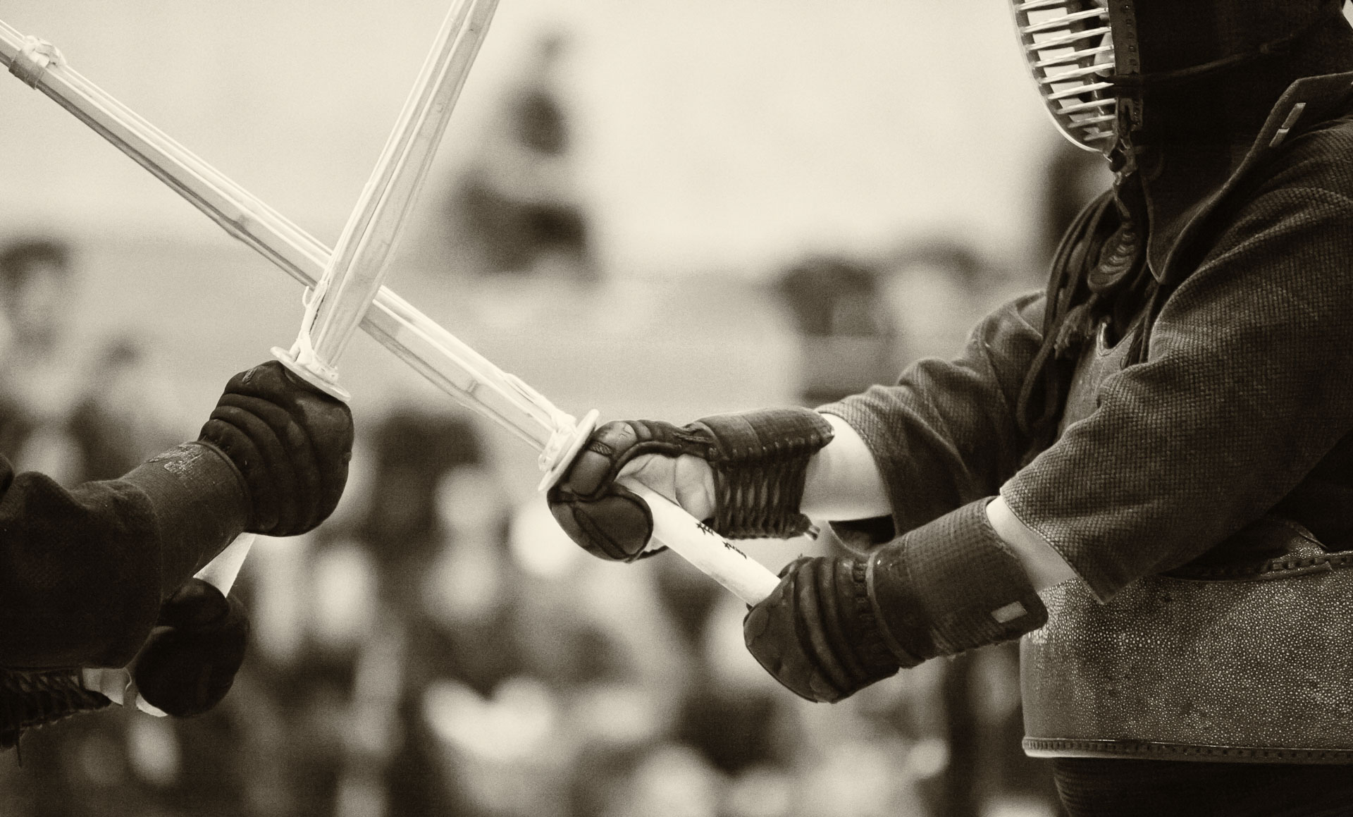
Even though we can define something, we often lack the deep understanding of it until we can experience the concept in question. In kendo, for example, it is almost trivial to memorize the names and superficial biomechanical descriptions of various techniques (waza). However, the understanding of the implications of the techniques develops gradually, through practicing them in multiple matches (shiai) and training sessions (keiko) against different opponents. I suppose, a similar difference exists between defining the various mechanical processes and artistic concepts that are involved in extracting a piece of music from a violin and actually playing it. Practice, as in physical doing, is the key word here.

By extension, the same principle applies to photography. It is not sufficient to mentally grasp the concept of camera shake, for example, that is caused by excessive rate of pressure on the shutter release button. To really understand the effect in conjunction with various focal lengths, shutter speeds and lighting conditions, one needs to practice rolling his/her finger over the shutter button hundreds of times and examine the results.

5DM2_MG_5456_10-20-12-Edit.jpg

Learning to be an extrovert

079A3065_04-01-2015-Edit.jpg

Any personality type has unique advantages and disadvantages. At certain times, though, it is important to be, or more precisely, to act, like an extrovert. This is particularly true in the case of teaching, where engaging the student(s) is of primary importance. Incidentally, this is a challenge to many academics in analytical areas, such as mathematics, where concentrated, solitary thinking process is an effective, perhaps even necessary, mode of operation, which naturally favours introverts. But since teaching is a necessary stage of any learning process, sometimes, even the most introverted person has to summon the ability to gladly engage other people at an emotional and intellectual level.

I believe that both martial arts and photography (or any visual or performing art, for that matter) offer excellent training grounds for the skill of behaving like an extrovert. Martial arts, by definition, involve communication with an opponent, and in photography, sharing photos, receiving and providing feedback and interacting with models, assistants, colleagues and the audience are the points of communication with other humans.

I do not suggest that one needs to change his/her natural behaviour in general. On the contrary, trying on a different personality type can enhance the inherent character strengths and, at the very least, help understand the other people’s perspective on the common issues.

1DX_9123_04-19-2014.jpg

Easter egg hunt

AA5Q2037_04-04-2015.jpg

Photographing children is often more challenging than shooting sports, because the clildren’s action is more unpredictable. For today’s Easter egg hunt with two three-year-olds, I used a Canon EF 70-200mm f/2.8L IS II USM lens lens on a 1D X body. I wanted to keep the aperture wide open for background isolation, so I had to reduce the shutter speed to about 1/1000 sec to avoid over-exposure. Also, I tried to position myself so I would shoot against the light.

Leading the children by playing with them in such a way that they would be well-positioned with respect to the camera makes a huge difference in child photography. This leading has to be done by someone other than the photographer. My wife is very experienced in this role, as she knows what angles and types of shots would work well for the pictures. As a result, my favourite pictures from today’s outing are of her playing with the kids.

AA5Q2157_04-04-2015.jpg

Event coverage

AA5Q1318_04-01-2015.jpg

When two important photo shoots happen on the same day, as it was in the case of this year’s the banquet for our university’s graduating athletes and the university graduation party, production planning and efficiency of operation become tremendously important. My associate Armando is very skillful in planning and running shoots like this, and over the past few years I have benefited tremendously from his experience by being able to experiment with new shooting styles, lighting setups and workflows, while having the safety net of his expertise in case the experiments would not yield desired results.

In general, I find that for any even coverage, having more than one photographer removes a lot of psychological pressure of potentially blowing up the assignment by making some kind of trivial mistake (e.g. missing a key moment of a wedding ceremony or an important speech due to equipment failure or having the wrong lens or camera setting as a result of trying to be creative).

With the two events happening back-to-back, we had to exercise economy of motion in terms of the setup and logistics. Fortunately, we had enough studio flashes, light stands and light modifiers to set up three photo booths at the same time. We started by preparing the setup for the graduation party and then moved to the banquet location a couple of city blocks away, where each of us was running a separate photo booth for different parts of the ceremony. In between the mandatory portraits of the award recipients, we were able to take candid shots of the students, speakers at the podium, eat dinner and pack up the gear when the work at one of the booths was finished.

AA5Q1303_04-01-2015.jpg

Overall, this year, we managed to balance the efficiency with being able to enjoy the events themselves. Of course, this would not have been possible without the help of six additional friends, who came out to help with the graduation party shoot. They did everything from taking the actual photos to managing the crowd of students of various degrees of sobriety. During the banquet, which was a formal event running according to a tight script, the crowd control aspect was naturally taken care of.

It was a long night, but as usual, the interaction with the students outside of classroom, their youthful energy and enthusiasm about our photography left us with a positive feeling.

079A3065_04-01-2015.jpg

Graduation party

079A3034_04-01-2015-edit.jpg
The theme of this year’s graduation party of our university was “Under the stars.” In the spirit of involving people in photography, we did some compositing right in front of the students, showing them the post-processing steps and asking for feedback along the way. We were using their portraits, which were taken just minutes earlier and super-imposing them on starry backgrounds. Instead of using a conventional photo booth approach that involves props, a backdrop with some (cheesy) images on it, and minimal post-processing, we wanted to try a more artistic process, which would limit the students’ choices in terms of poses, but would produce higher quality (arguably, still cheesy) images.

From my perspective, the new process was more rewarding than the conventional one, not in the financial sense, but in terms of improving the quality of the interaction with the students. The students were generally more appreciative of our work and seemed to enjoy seeing the inner works of the photo manipulation process.

In terms of the workflow of the entire photo shoot, selection of the portraits from the sets of five or six still presented the main bottleneck, even though this year we had two computers operating at the same time (compared to one last year) and had a substantially smaller number of photos taken of each group of students. This is not surprising, as culling of raw images is the major time-consuming stage of any photography project, whether the clients are involved in it or not.

079A3313_04-01-2015-Edit.jpg