Using colours

DSC06508_02-20-2017

My daughter likes drawing. We brought her colored pencils, markers, crayons and watercolors with us to Milan, and she has been using it gen at every opportunity. She even sketched sculptures in museums and churches. My wife and I are both delighted and a bit surprised, because this kind of drawing requires genuine concentration, which we don’t generally expect from a five-year-old.

Naturally, we are encouraging her interest as much as we can. In fact, it is easy to do, because there is a nice confluence between her and my interests. Lately, I also have been working on getting back to drawing – I use sketching as a memory-training exercise.

I have my own set of pencils and greyscale markers, and my daughter is always delighted when she gets to borrow them. However, grey is not a very useful colour, when one’s main subjects are princesses and unicorns. Still, she naturally wants to reciprocate and always asks if I would like to borrow her colourful markers.

DSC07752_03-04-2017

This past Sunday, she offered her markers again, and she also said that it would make her particularly happy if I used as many of the colours as possible. My initial impulse was to say “Thanks, but no thanks”, but then I decided to consider this as a creative challenge. In fact, using as many colours as possible is the opposite to restricting one’s palette, which is a common creative technique.

So, as a reference for my sketch, I chose a photo that I took the day before at the Carnival Ambrosiana. On it, my daughter is throwing a handful of confetti into the air. Here is the result – I satisfied the condition of using a whole bunch of colours in a single drawing!

DSC08025

On contrast and balance

22565967704_171e9f8155_k

I think that, ultimately, what makes an image (photograph or painting) visually appealing is contrast. There are many types of contrast: large and small objects in the composition, empty and filled spaces, dark and light areas (the actual contrast in the photographic terms), warm and cool colours, contrasting colours (e.g. red/green, orange/violet), etc. A skillful artist uses contrast to create an exciting image, and when a dilletant by chance snaps a photo with great impact, it usually prominently features one or more types of contrast.

Perhaps, what makes us like the contrast is our inherent striving for balance. When we are viewing a high-contrast image, we are being taken on a roller coaster ride along the range of hues and grayscale values, and we find the sensation of the loss of control entertaining.

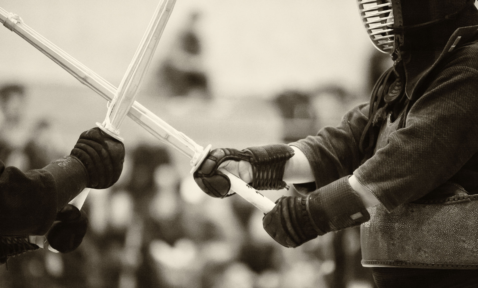
Actually, human tendency to strive for balance is routinely exploited in martial arts, such as aikido or kendo, because when we are taken off-balance, we tend to automatically (i. e. spontaneously and unconsciously) over-compensate and put ourselves in a precarious position. Also, contrast between periods of calm and explosive motion wakes the fight exciting and interesting to watch. On a somewhat deeper level, when a kendo technique, for instance, posesses a quality of contrast it looks appealing to the judges (shinpan). For example, striking a high target, such as men, from a low shinai position (geidan no kamae) is inherently interesting, and such contrast (low/high) in technique has been known to attract recognition in tournaments.

15912472544_fc8f8d6052_k

Indigo

IMG_9188_01-03-2015-Edit.jpg

My favourite colour is blue. Or maybe, purple, because in painting, it can appear either cool or warm, depending on the adjacent colours. Naturally, I find the colour indigo, which is between blue and purple in the electromagnetic spectrum, fascinating, with all its history and applications in art (fashion) and martial arts.

The indigo dye was developed in India, and it was a very rare commodity in Europe in the middle ages. During Napoleonic wars, which coincided with the development of technology that allowed mass production and dyeing of fabrics, the French uniforms (habit à la française) were dyed with indigo.

In Japan, the import of silk from China was restricted during various prolonged periods, and cotton was difficult to dye with anything, except indigo. Over time, an intricate process, indeed an art form in itself, of indigo dyeing was developed. There is a belief that indigo dye repels bacteria and insects. Probably, for that reason, practice uniforms for kendo (keiko go) are traditionally coloured with indigo.

Nowadays, indigo is often used to colour denim fabric. Interestingly, the much thought-after Japanese denim is often made on vintage shuttle looms, developed by Toyoda company in the 1920s. These looms are slow and produce a nonuniform fabric by today’s standards, but for denim, this is a valuable feature, as slight variations and imperfections is what makes the jeans unique.

IMG_9200_01-03-2015-Edit.jpg

I took some macro photos of the fabric of two pairs of jeans that I own: a factory-distressed pair bought as a souvenir while I was on sabbatical in Japan (I was lucky to find a size that fit) and a brand new “raw” denim pair (i.e. it has not been washed after dyeing). True denim enthusiasts are rumoured to go month or even years before washing their raw jeans in order to develop the wear patterns that are unique to the wearer. I don’t think I will go that far (my kendo keiko gi is sufficiently sweaty, so I would rather keep my other clothes relatively clean), but breaking in the new jeans will be a fun little project, even just for observing the changing hue of the indigo dye. Perhaps, I will take more closeup shots of the fabric to record the process.

I don’t think I will be able to reproduce the cool wear patterns of the pre-distressed jeans, but it is neat to know that they will be will be one-of-a-king and, in a very direct way, an expression of my lifestyle.

IMG_9199_01-03-2015-Edit.jpg