Involving other people in photography

More photos here: http://ow.ly/BabJT

For many people, who start doing photography as a hobby, which later develops into a professional pursuit, their interests progress from shooting inanimate subjects (e.g. landscapes, architecture, stars) to nature to people (first street photos, events, then portraits). This was certainly the progression of my interests, from astrophotography and travel photos to sports and portraits. Naturally, photographing people means communicating closely with them, getting to know them, in other words, becoming involved with the subjects.

However, taking photography to a new level means involving people in your projects in a more general sense. Larger photoshoots require more elaborate production, which means working with more than one photographer, assistants, makeup artists, in addition to the models.

Ukai

Even putting aside the logistics of production, my photo projects definitely benefit when they involve people. For example, taking the photo above of fishing with cormorants (ukai) was only possible because I talked about my plans to do travel photography around Nagoya with my neighbour on the long flight to Japan. It turned out that she was from Inuyama, and suggested it as a destination. When I got there, I stretched my Japanese ability to the limit to make a reservation of the ukai boat tour. Initially, the tour company was reluctant to take me, as they did not have an English-speaking guide that day, but my willingness to talk to them and explain that I was interested in photographing the fishing action more than having a dinner on the boat convinced them that I would be able to handle a tour in Japanese.

Generally, having other people involved in photo projects adds many motivating aspects:

  • Collaborating with others boosts creativity.
  • Having others by my side helps me avoid technical mistakes.
  • Having others involved creates accountability, which helps me follow through on the plans.
  • Without the support of other people, many shoots would simply be impossible. For example, my wife is deeply involved in most creative projects, from brainstorming shoot lists and posing ideas to arranging the props and other logistics. Last, but certainly not least, she takes care of our daughter when I go out on long shoots during weekends.

Someone noted recently that all we do in our lives is, ultimately, communicate with other people one way or another. With my photo projects, I plan to do so more actively and consciously by getting people involved at all stages.
AA5Q1298_07-08-2014-Edit.jpg

Shooting portraits by the bonfire

AA5Q3263_10-31-2014.jpg

It is Halloween time, and tonight we visited the huge Oak Bay bonfire organized by the local firefighters. Photographing people by the fire is challenging, and the camera settings depend on whether the light source, i.e. the bonfire, is in the frame or not.

If the fire is not in the picture, but simply shines the light on the subject, such as in the photo above, the basic concepts of shooting in low light apply. One needs a fast lens (one with a low minimum f-number) and a camera with good low-light performance. My wife used a Canon EOS-1D X with a 35mm f/1.4L USM lens.  I usually just let the camera expose correctly for the subject and not worry about the background, which will come out either over-exposed (if it is still twilight) or under-exposed, if it is already dark. In either case, it can be ignored if it does not contain anything of interest.

On the other hand, if the fire is in the background, in other words, if shooting against the light, the dynamic range of the scene (the difference between the lightest and the darkest parts) is too great for any modern camera to handle. There is no choice but to add artificial light to the subject. An on-camera flash is far from ideal light source, but it is often the only choice in a given situation. This is what my wife used to take the image below. In manual mode, if the aperture and the ISO are fixed, the shutter speed can be used to control the exposure. When checking the exposure, it is important to look at the histogram, since images on the camera LCD screen appear much brighter than they really are.

AA5Q3289_10-31-2014.jpg

Another challenge of shooting with a flash, with fire in the background, is that the colour temperature of the two light sources is very different. The flash is daylight-balanced, while the colour of the fire is very warm (red-orange). One way to balance the image is to correct the colour of the subject in post-processing. In Lightroom, this can be done using a local adjustment brush, which is what I did for this image. In Photoshop, this can be done using adjustment layers applied to a part of the photo.

An alternative to correcting colours in post-processing is to use gels on the flash. A gel is, basically, a piece of a coloured plastic, which is attached to the flash by a rubber band.

Personally, I prefer leaving the colour correction until I can see the photo on a computer and can experiment with various effects. After all, the warm colour of a bonfire creates a special atmosphere that is worth preserving in the final image.

AA5Q3134_10-31-2014.jpg

Being engaged in the action: difference between professional and amateur photographers

Rock!

The main difference between sports, travel and event photographs shot by professionals and amateurs is the degree of involvement of the photographer in the action. When I started taking photographs of festivals, sporting events and people in the streets, my subconscious desire was to be a “fly on the wall.” I wanted to convey in my photographs a sense of the action without disturbing the participants or being engaged in the event myself. As I kept shooting this way, my technical skills grew, but it became apparent that it was the non-participant’s mindset that was limiting my progress.

Gradually, I became more comfortable becoming more actively engaged in the action that I was shooting. Part of this is just technique. For example, it is often taught that in order to take better photos of playing children, the photographer needs to get to their level – lay on the floor or on the ground. However, a large part of this approach is mental attitude. If you enjoy the event itself, this notion will be conveyed in the photos, and the way to enjoy the action is to be genuinely interested in it and to interact with the other participants.

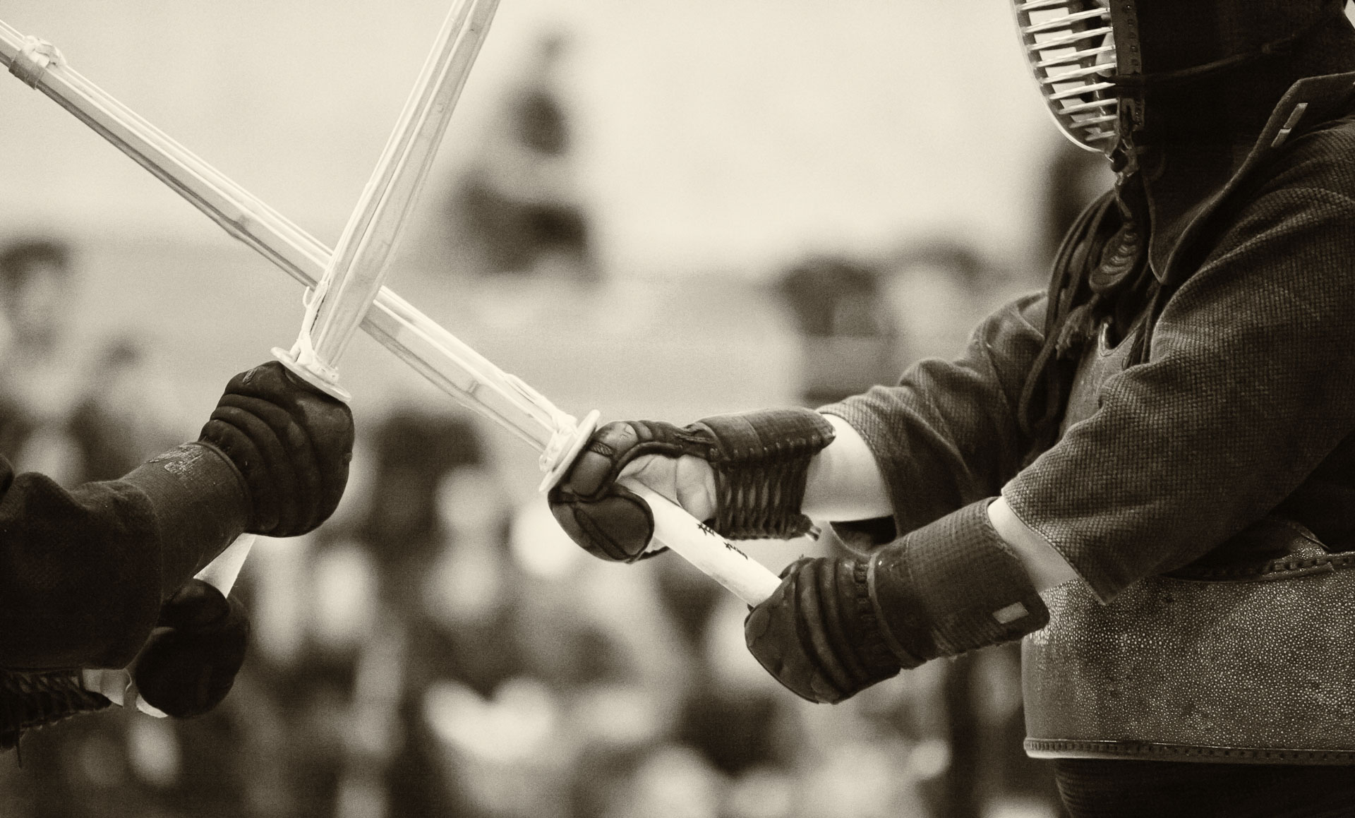
This active approach to photography, which distinguishes professionals from many amateurs, is a skill, and as such, it require practice to develop. (I hesitate to say “to master”, because from my experience in kendo, I have yet to see a limit to a particular skill that would qualify as “mastery” – there is always room for improvement.)
More photos on Flickr: http://ow.ly/xvxoDComplete set: http://ow.ly/xvxro

So what does it take in practical terms to take photos that convey engagement with the subject?

  • First, it means getting close to the subject. This implies genuine interaction, often with eye contact. There is no way to fake it.
  • Second, I take my best photos when I know the subject well. Again, this means genuine interest.
  • I try to take opportunities to shoot in difficult conditions in terms of weather or lighting. Doing so conveys willingness to share the challenging conditions with the participants of the game, event, etc.
  • To shoot in challenging conditions, I use professional-level gear (Canon EOS-1D X camera and L-series lenses, for example, a rugged and “fast” Canon EF 70-200mm f/2.8L IS USM).
  • Finally, there is a real advantage of actually being a professional. A media pass to an official event provides access to shooting positions and locations that are simply not accessible to the general public. So, what to do if you are attending an event as a spectator? Shoot what you can most easily relate to – other spectators, the setting,… convey the sense of your experience. And get to know the players/actors/organizers – this can lead to getting your own media pass for the next time!

AA5Q9249_10-04-2014.jpg

Making math look good: advertisement photoshoot for a calculus course

Problem solving

Last summer, my wife was involved in designing a short course in calculus for incoming first-year students at UVic. To help promote this course, we set up a staged photoshoot with current students and instructors as models. Armando and I set up the lighting (studio strobes with softboxes and umbrellas) in the actual classroom where the course would be taught. We had a relatively short shooting list: couple of shots of individual students writing on the board, a group portrait of them having a conversation in front of the board with formulae written on it, and a group portrait of the students talking to the instructor.

The key image, shown above, is a composite of two photos: a shot of the student pretending to be writing (he was holding the marker in mid-air) and a shot of the math formulae written on a white board with a blue marker.

Here is how I made it:

  • Opened both photos in the same Photoshop document: the portrait on the background layer and the shot of the board on the layer above it.
  • Created a Curves adjustment layer above the top layer.
  • Clipped the adjustment layer to the layer below it. To do it, I clicked the left-most icon at the bottom of the Curves menu, which looks like a square with an arrow pointing down. This makes the adjustment layer affect only the layer immediately below it, not all underlying layers.

Screenshot 2014-10-24 22.26.46

  • Increased the exposure (by dragging the midpoint of the curve in the layer menu upwards). The purpose of this is to over-expose the image of the white board, so that everything, except the text, becomes solid white.
  • Selected the layer with the board image, and clicked on the white colour with the magic wand selection tool (activated by pressing W). I held Shift key and click inside all areas enclosed by the blue lines, such as the areas inside the loops of 6’s. This created a mask containing everything, except the blue text.
  • Pressed Delete key. This removed the white board and left only the blue text.
  • Removed the selection by going to Select > Deselect in the top menu bar (or pressing Command-D).
  • Selected everything in the layer (i.e. the text) by going to Select > All (or pressing Command-A).
  • Went to Edit > Transform >Flip horizontal to create a mirror image of the text.
  • Selected the move tool (by pressing V) and dragged the image of the inverted text to align it with the marker in the student’s hand.
  • That’s it! I saved the  Photoshop document to preserve the layers. The flattened composite image can be saved in any format afterwards as a copy.

AA5Q9271_06-19-2014-Edit.jpg

Close-quarters shooting using a fisheye lens

untitledAA5Q6565_09-26-14.jpg

As a part of collaborative research of hybrid-powered ships, my colleagues and I recently visited the first diesel-electric vessel in the BC Ferries fleet, M.V. Tachek, which operates between Quadra Island and Cortes Island. I new that we would have an opportunity to visit the machine compartment, among other areas that are normally restricted to passengers, so I wanted to photograph them to document the site visit and to promote this research project on the web.

I expected to shoot in a highly-confined environment with poor lighting, so I packed my Canon EOS-1D X DSLR, which has remarkable low-light performance, and fast lenses (35mm f/1.4L USM for extremely low light and 16-35mm f/2.8L USM for extremely tight quarters).

untitledAA5Q6441_09-26-14.jpg

Also, Armando lended me his Canon EF 15mm f/2.8 Fisheye lens, pointing out that it would be better for photographing people than the 16-35mm f/2.8L. He was absolutely right. Of course, the fisheye creates a lot of distortion, but this distortion is of a different kind, compared to that of a rectilinear lens, such as the 16-35mm f/2.8L. Since a rectilinear lens is designed to preserve straightness of straight lines, objects near the edge of the frame appear to be stretched and enlarged, which is not flattering to human faces. On the other hand, a fisheye lens covers the 180° field of view by reducing the scale of objects towards the edge of the frame. It also does not preserve straight lines, but since a human face does not contain many straight lines, this is typically not a problem.

As it turned out, the machine compartment of the Tachek was more spacious than I thought, but the fisheye lens produced fun images with a unique perspective.

untitledAA5Q6720_09-26-14.jpg

Here are some tips for using a fisheye lens:

  • Compose a portrait so that the face of the subject is located close to the middle of the frame to minimize distortion.
  • If there is a horizon line, place it so that it crosses the centre of the frame – this way, it will not be distorted.
  • In many situations, such as sports or other action, for example, it is a good idea to switch the lens to manual focus and manually focus just short of infinity. Because ultra-wide angle lenses have huge depth of field, compared to normal or telephoto lenses at the same f-numbers, almost everything in the frame is going to be in focus all the time, regardless of there the focussing point of the camera points to. Turning off autofocus can maximize the framing rate, particularly in low light situations.

Building wedding portfolio: staged photoshoot

AA5Q1393_07-08-2014.jpg


A staged wedding photoshoot at the historic Empress Hotel in Victoria was one of the major photography projects for me last summer. Armando and I wanted to expand our portfolio beyond sports, so we approached our friends, who work at Lugaro Jewellers and the Empress, as well as colleagues, relatives and local models and makeup artists and proposed this collaborative project.

The shoot involved three photographers (Armando, Ilijc and myself), two male and two female models, and my wife, who was involved in all aspects from brainstorming the shooting list and posing ideas to coordinating the jewelry inventory. The preparations were fairly involved, and literally every aspect required multiple iterations and coordination with many people. We had to find a date that worked for everyone, contact local bridal boutiques to borrow a wedding dress (one of the models had her own dress) and visit the location beforehand to decide on the lighting setup and the shooting list.

AA5Q0978_07-08-2014.jpg

The day of the photoshoot was quite intense, as we planned a lot for the eight hours. We shot in two rooms: first in a library, and then in a banquet hall. At each location, we had two lighting setups operating simultaneously, and the models rotated between them, changing the outfits and jewelry in the process. We used Paul C. Buff Einstein E640 studio flashes with various diffusers and umbrellas to modify the light. We shot with Canon DSLRs (1D X and 5D Mark III) and various lenses, from 35mm f/1.4L USM to 70-200mm f/2.8L IS II USM (the most useful one) to 85mm f1.2L II USM (most spectacular one).

AA5Q1298_07-08-2014-Edit.jpg

As I look through the images after being focussed on other projects for a few months, I am glad that I had this pause to become a little detached from the whole planning/staging/shooting experience. Looking at the photos with fresh eyes helps me appreciate how much effort everyone involved put into this project and how much I learned from it.

Window light

AA5Q9857_05-25-2014.jpg

Window light is ideal for indoor portrait photography. In fact, some light modifiers (e.g. umbrellas or soft boxes) used in studio lighting setups are designed to replicate this natural lighting condition. There are several good reasons for this.

First, a window is a very large light source, compared to the subject, which results in a diffused, flattering light with soft shadows (smooth transitions between the lighted and shaded areas). A general rule that applies here is this: large light source (e.g. cloudy sky) = soft shadows; small light source (e.g. uncovered light bulb) = harsh shadows.

Second, the colour temperature of the daylight matches that of a daylight-balanced (read: standard) flash, which makes it very easy to use a fill-in flash without having to worry about correcting the skin tones in post-processing. A caveat here is that the shoot is happening close to the middle of the day, not during the “golden hours” around sunrise and sunset that are so desirable for outdoor portraits. So, here is a tip: schedule an indoor photo shoot during the day, if there is an access to a large window.

Third, there is something “right” about the height of the light source represented by a typical window – it is neither too high nor too low to cause unnatural shadow patterns on the subject’s face.

Because of these nice features of window light, I always try to take advantage of it when my daughter is getting ready to go out and is looking out of the window in our hallway. These moments are fleeting, so here is another tip: experiment with camera setting beforehand and save them as a custom preset if your camera allows it. (Here is how to find custom functions in a Canon EOS camera.)

In the photo above, my daughter is going to Raffi‘s concert, and to a dance class in the image below.

AA5Q5987_09-20-2014.jpg

Young athletes

IMG_0006.JPG

I was taking photos of Vikes children’s summer camps couple of weeks ago and noticed how wide is the range of athletic abilities of the kids of the same age. Boys and girls, who are about ten years old, are particularly different.

At the Boulder rock climbing gym at Stelly’s Crossroad, most of the boys noticeably struggled to climb much higher than about twice their own height. I must say, I clearly remember that I was the same at that age – any sort of climbing was not my strong suit. (Come to think of it, I might still be the same now…) However, some girls from the same age group literally walked up the climbing wall, all the way to the 50-foot-high ceiling. Clearly, girls have an advantage in terms of power-to-mass ratio!

IMG_0007.JPG

Interestingly, things were just the opposite in the soccer camp. With very few exceptions, little girls were quite unbalanced when striking the ball – from the kendo background, I could clearly see that their weight shifted to the back foot as they ran up to the ball and also during the defending drills (for the older girls). On the other hand, most of the boys could kick through the ball quite confidently, keeping their balance throughout the motion.

Correction (few days after): now after looking at the photos, I can say I was wrong about the soccer: boys and girls look about equal – most are quite clumsy. Image below is an exception – this little dude was amazing!

IMG_0013.JPG

On sharing

IMG_0121.JPG

My daughter is three years old and has a strong sense of personal property, typical for this age. About two weeks ago, she gave us a vivid illustration of the fact that sharing, as a concept, is a two-way interaction.

On the way to the Beacon Hill park, we realized that we left our daughter’s sandbox toys at home. She was a little upset, but we told her that there were many other interesting things at the park – swings, slides, a zip line, etc. She would just need to share them with other kids. The virtue of sharing is not taken for granted at her age, to say the least, so it took quite a bit of convincing before she agreed that sharing is a good thing to do.

As we came to the playground, she saw somebody else’s plastic bucket and toys in the sandbox and immediately suggested: “Let’s share those!” How can you argue with this? After all, sharing is good!

Disneyland

AA5Q2099_07-19-2014.jpg

The ASME PVP conference in Anaheim is over. It was my first major organizing effort. Everything went well, but I must say, I am happy that it is finished. My wife and daughter came with me to the trip, and we are now enjoying a week-long vacation in Venice Beach, CA.

AA5Q2201_07-19-2014.jpg

My daughter was talking about flying in an airplane for weeks before the trip, and she actually enjoyed the flights – a rare (I suppose) case of expectations matching the reality. At the Hyatt hotel in Anaheim, we received an upgrade to a “fireworks view” room, from where the daily fireworks shows over the Disneyland are visible. In this case, the reality proved to be too intense for a two-and-a-half-year-old. Our little one is not crazy about loud noises, to say the least. So, by popular request from the audience, curtains were drawn over the fireworks shows.

AA5Q2868_07-25-2014.jpg

On Friday after the conference, we went to the Disneyland. It was the first visit ever for me, and the third for the ladies, who went there two times while I was at the conference. After all, apparently, it is the only attraction in Anaheim. Our daughter is a bit too young for most of the rides, but she enjoyed visiting the princesses, the Goofy’s house, a play at the Royal Theatre.

AA5Q2805_07-25-2014.jpg

AA5Q2787_07-25-2014.jpg

Photography-wise, I tried to follow the advice of Jim Harmer of Improve Photography to take images that have personal meaning and emotional content (he gave an example of a close-up of a child’s sweaty forehead taken while climbing the Eiffel tower over a cliché full-figure portrait with the tower in the background). I took a few pictures of my daughter, all with a Canon EF 35mm f/1.4L USM lens, mostly wide open. The colours in the Disneyland are so bright and open, that even when the surroundings are completely blurred out.

Each day during this trip is ending by either my wife or me reading a book on an iPad to our daughter before bed. “Varezhka”, based on an old Russian cartoon, is the current favourite.

AA5Q3002_07-25-2014-Edit.jpg