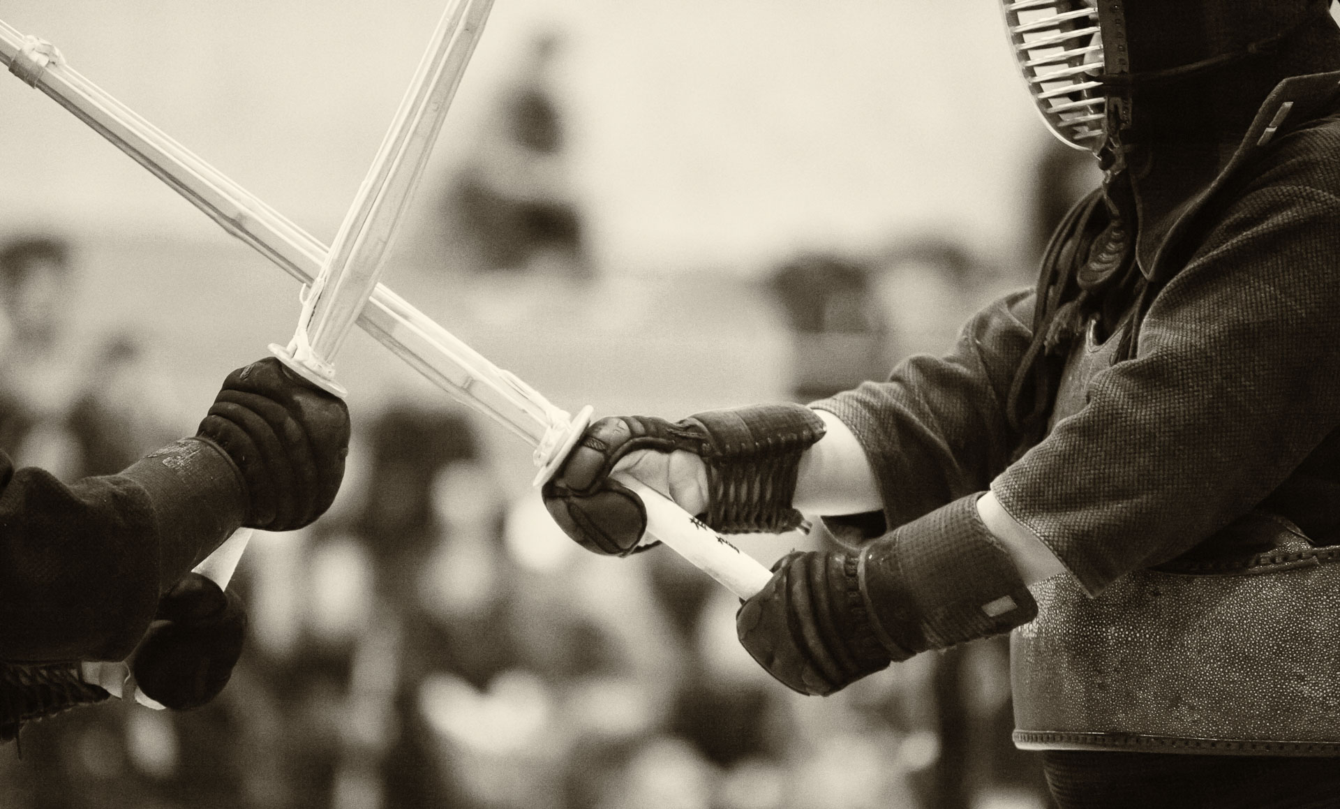
Using self-imposed constraints in the way the information is delivered can make the message more powerful. Similarly, economy of information, i.e. how much of it is being transmitted, is also an important concept. Amanda Palmer pointed this out in her interview with Tim Ferriss in relation to music, but I believe it also applies to visual arts and teaching.
In photography, painting, calligraphy, etc., the use of negative space allows the viewer to complete his/her own personal version of the image, given the limited amount of visual clues provided by the artist. Personally, being a fan of Japanese art, I would like to explore simplifying the composition and limiting visual elements in some of my typical shooting scenarios (sports, travel, landscapes, portraits) without necessarily resorting to minimalism.
On a similar note, teaching often fails by providing the students with too much content (for their level of knowledge, duration of the class, etc.) and rarely (if ever) by giving too little information. Leaving something for self-study allows the students to engage with the material and make it “their own”. I must say that having just finished teaching a relatively large course, I am looking forward to limiting the course-related information that I both receive and transmit to bare minimum for the next few months.


