Indigo

IMG_9188_01-03-2015-Edit.jpg

My favourite colour is blue. Or maybe, purple, because in painting, it can appear either cool or warm, depending on the adjacent colours. Naturally, I find the colour indigo, which is between blue and purple in the electromagnetic spectrum, fascinating, with all its history and applications in art (fashion) and martial arts.

The indigo dye was developed in India, and it was a very rare commodity in Europe in the middle ages. During Napoleonic wars, which coincided with the development of technology that allowed mass production and dyeing of fabrics, the French uniforms (habit à la française) were dyed with indigo.

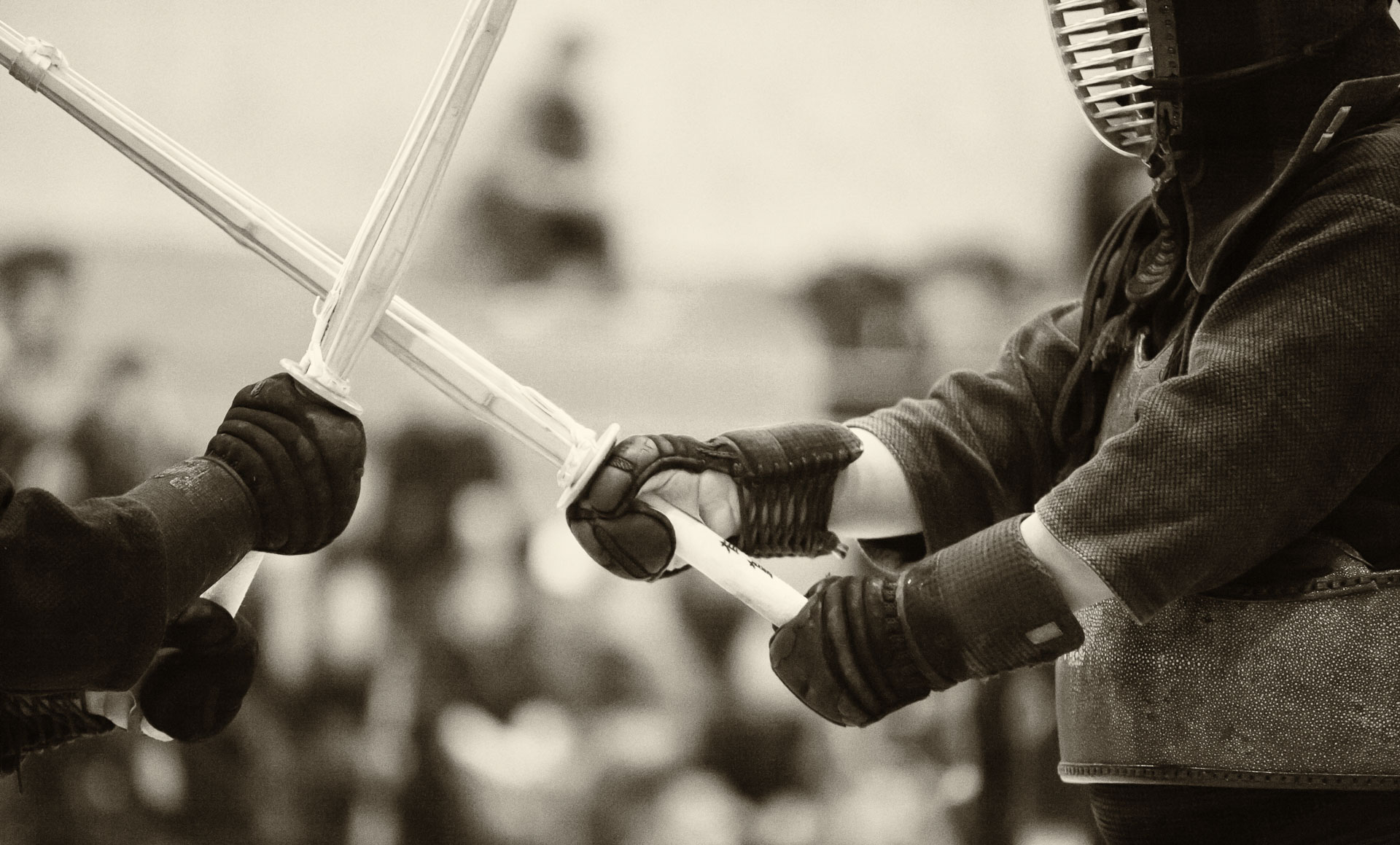
In Japan, the import of silk from China was restricted during various prolonged periods, and cotton was difficult to dye with anything, except indigo. Over time, an intricate process, indeed an art form in itself, of indigo dyeing was developed. There is a belief that indigo dye repels bacteria and insects. Probably, for that reason, practice uniforms for kendo (keiko go) are traditionally coloured with indigo.

Nowadays, indigo is often used to colour denim fabric. Interestingly, the much thought-after Japanese denim is often made on vintage shuttle looms, developed by Toyoda company in the 1920s. These looms are slow and produce a nonuniform fabric by today’s standards, but for denim, this is a valuable feature, as slight variations and imperfections is what makes the jeans unique.

IMG_9200_01-03-2015-Edit.jpg

I took some macro photos of the fabric of two pairs of jeans that I own: a factory-distressed pair bought as a souvenir while I was on sabbatical in Japan (I was lucky to find a size that fit) and a brand new “raw” denim pair (i.e. it has not been washed after dyeing). True denim enthusiasts are rumoured to go month or even years before washing their raw jeans in order to develop the wear patterns that are unique to the wearer. I don’t think I will go that far (my kendo keiko gi is sufficiently sweaty, so I would rather keep my other clothes relatively clean), but breaking in the new jeans will be a fun little project, even just for observing the changing hue of the indigo dye. Perhaps, I will take more closeup shots of the fabric to record the process.

I don’t think I will be able to reproduce the cool wear patterns of the pre-distressed jeans, but it is neat to know that they will be will be one-of-a-king and, in a very direct way, an expression of my lifestyle.

IMG_9199_01-03-2015-Edit.jpg

Photographing water droplets: setup plan

PO-IMG_1460_12-07-13.jpg

I am planning a research project that will focus on close-up photography of liquid drops and splashes. So far, I have no photos of my own to illustrate this post, but here is the equipment list for the setup that will be developed in the Fluids Lab:

  • Camera. I will use a Canon 5D Mark II or 5D Mark III, since it has higher resolution than a Canon EOS-1D X. The higher framing rate of the 1D X offer no advantage in this case, since the motion will be frozen by the flashes.
  • Lens. I will start with a Canon EF 100mm f/2.8 Macro USM Lens, but a Canon EF 180mm f3.5L Macro might be a better option for shooting from greater distance.
  • Shallow water tank (tray). I plan to ask the students to build a shallow water tank that would be quite long, so we could shoot along its length and avoid getting the front and back edges into the frame.
  • Studio flashes. Three Paul C. Buff’s “Einstein” lights will be triggered by dedicated radio triggers. Two of them will be positioned on the sides of the tank, and the third one will be placed behind a semi-transparent background.
  • Intervalometer. I will use a trigger for the camera and the valves that will release the drops. There are several options, including a Time Machine/Drip kit.

I am looking forward to this project (should it be called a still life, even though the droplets would be in motion?) and hope to post the updates with our first droplet images soon.

PO-IMG_2011_12-07-13.jpg

On contrast in macro photography: using props and backgrounds

5DM2_MG_5406_10-20-12-Edit.jpg

In macro photography, achieving substantial depth of field is an inherent challenge. In fact, there is often no other way of getting the entire subject in focus, but to assemble the final image in post-processing as a composite of photos, each focussed on a different part of the subject. Thus, a background in a typical (non-composite) macro photo is often completely blurred. Nevertheless, the choice of the background is very important for the overall impact of the photo. Generally, I try to select the background so that its tone would contrast with the subject’s (i.e. the subject would be light on dark or vice versa). The colour of the background depends on whether I want to achieve more contrast or complement the subject. Often, the tonal contrast with the subject is sufficient, and I would use a complementary to the subject or neutral (such as black or white) background. If I do need colour contrast, I usually try to avoid using basic colours (red-green, orange-violet, etc.) and instead use a warm-cool hue of the same colour, which produces a more subtle result.

5DM2_MG_5575_11-01-12-Edit-Edit.jpg

The surface on which the subject is placed is also important. Typically, I like when its texture contrasts with the subject. For example, rough, textured surfaces, such as wood or stone, work well with highly-polished objects, such as jewellery or glassware. A notable exception to this is using reflecting surfaces underneath highly-polished or metallic objects, which is also very effective.

Also, I find that adding props often greatly enhances a macro photo. In order for the props not to compete with the subject, I try to place them so that they would be slightly out-of-focus, which is easy to achieve because of the shallow depth of field feature of macro photography mentioned at the beginning of this post. To me, the interesting aspect of macro photos is that they reveal the details that are not normally visible to the human eye but also hint on the story of the object, how it might be used, its history or cultural references.

Romance

As far as the equipment, I use a Canon EF 100mm f/2.8 Macro USM Lens on a 5D Mark II body. The lighting is usually provided by three studio strobes (the link is to a starter kit on Amazon, not the actual lights I have) triggered either with a PocketWizard or optically, with an on-camera 580EX II Speedlite or an infrared transmitter, as I described in this post.

Bling

We started expanding our wedding photography portfolio by taking pictures of rings, graciously provided by Krikor and Marina of Lugaro Jewelry. My original plan was to bring the lights and the diffuser tent to the store, but it became apparent that photographing diamonds requires much more light than could be comfortably accommodated on location.

In fact, at least three lights are needed to capture the brilliant facets of a diamond in colour: a key – highly diffused light, and two additional lights of different intensity. I used an Alien Bees studio flash with a large soft box diffuser, positioned overhead, as the key light, another studio flash without a diffuser on one side and a Canon Speedlite 580EX II on the opposite side. The flashes were optically triggered by another Speedlite (camera-mounted) in a manual mode. Note that E-TTL setting cannot be used on the trigger Speedlite, as it would emit a pre-flash that would cause early triggering of the other lights.

Another point to consider when photographing jewelry or gemstones is textural contrast. Since the objects themselves are highly polished, hard and reflective, using a background that is rough, soft and light-absorbing is a good idea. Of course, rules are made to be broken, so a reflecting background, such as this hand-painted lacquer tray from Kanazawa, can complement the main object nicely.

20140628-004459-2699629.jpg

The biggest challenge, of course, is to come up with an original idea for a photo after seeing hundreds of highly polished, but similar, images in magazine ads. The idea to use a book emerged during the shoot. The book, incidentally is one of the volumes of Pushkin’s letters – a tribute to our heritage and, paraphrasing Obi-Wan Kenobi, a more elegant time.

20140628-004553-2753121.jpg

The most rewarding aspect of this project for me was a chance to do it together with Svetlana, who was involved at all stages. We used to do a lot of photography side-by-side during our travels before Anya was born, but since then, I was doing most of the shooting, and my style, technique and even equipment changed. This time, Anya was in daycare, and we could both focus on the shoot. Perhaps, one day in the future, we will shoot together with Anya?

Chess as Art

5DM2_MG_5472_10-21-12-Edit-Edit.jpgIt is generally accepted that photography can be art, that is, an artist can express him/herself through it, and others can recognize this expression in the photograph. Likewise, a martial art can be an art ( hence, the term). What about the game of chess? It shares many aspects with martial arts, except, perhaps, the physical one. There is conflict, strategy, tactics, pressure, discipline. Arguably, these concepts can be appreciated only by observing the dynamics of the game as it is being played out. But is it really true? Are there inherently beautiful chess positions? Perhaps, they are not unlike beautiful mathematical formulae, which can be appreciated even by someone with a fairly limited knowledge of he subject.

For a while, I had an idea for this project: to try to take artistic photos of famous chess positions – not to attempt to document the game, but to simply treat it as a still life. So here is my first experiment. I used a 100 mm macro lens to photograph this still life with our new maplewood-and-ebony chess set that Svetlana and I bought during our recent visit to Munich.

5DM2_MG_5456_10-20-12-Edit.jpgThis is the position at the move number 16 of the 1945 United States vs. Soviet Union radio match between Denker (White) and Botvinnik. Often used as a classic example of a relative pin applied early in the game, this layout is a result of a flurry of tactics unleashed by Black, who constantly shifted the focus of his attacks, and daring sacrifices by White. This is a partial view (not showing all pieces – as I mentioned, the intent is not to document the position) of the middle-game seen from the White camp. Do you feel the drama?

What happened next? 16. …Qc7. And White did not last long.