Critical thinking

Yesterday, our daughter invited my wife and me to visit her after-school robotics club. I was quite impressed by how her teacher handled the problems that the students encountered while working on their codes and mechanical designs. When they reported a problem, he would ask a variation of this question: “What element do you think needs to be changed?” I think this question is incredibly powerful, because it simultaneously encourages the students to do two things: to critically analyze the current state of the project and to identify the next specific step in the solution.

For example, my daughter was writing a code for her Lego EV3-based robot to undergo a mission consisting of driving to a specific spot on the table while avoiding the specified boundaries, performing a 720-degree turn while keeping one wheel inside the target spot and returning back to the starting area. She had trouble with returning back to the base, but with the above prompt from the teacher was able to identify the problematic lite in her code – the robot was turning a bit too much during one of the turns on the way back – and to fix it. Another student was having an issue with the design of his robot – it was getting stuck on its way to the target spot. The same question helped him to realize that the wheels were catching on the base, and the solution was quickly found.

I would certainly like to borrow this question for my own use – in the interactions with my students in the courses I teach and in the lab, with my daughter (helping her to solve the problem at hand without offering a ready-made solution) and directed to myself as a means of teasing out a constructive way forward in whatever I do without being overly critical for the apparent failure of the current state of affairs (the question asks to think about one specific aspect to be changed, not the worthiness of the entire project).
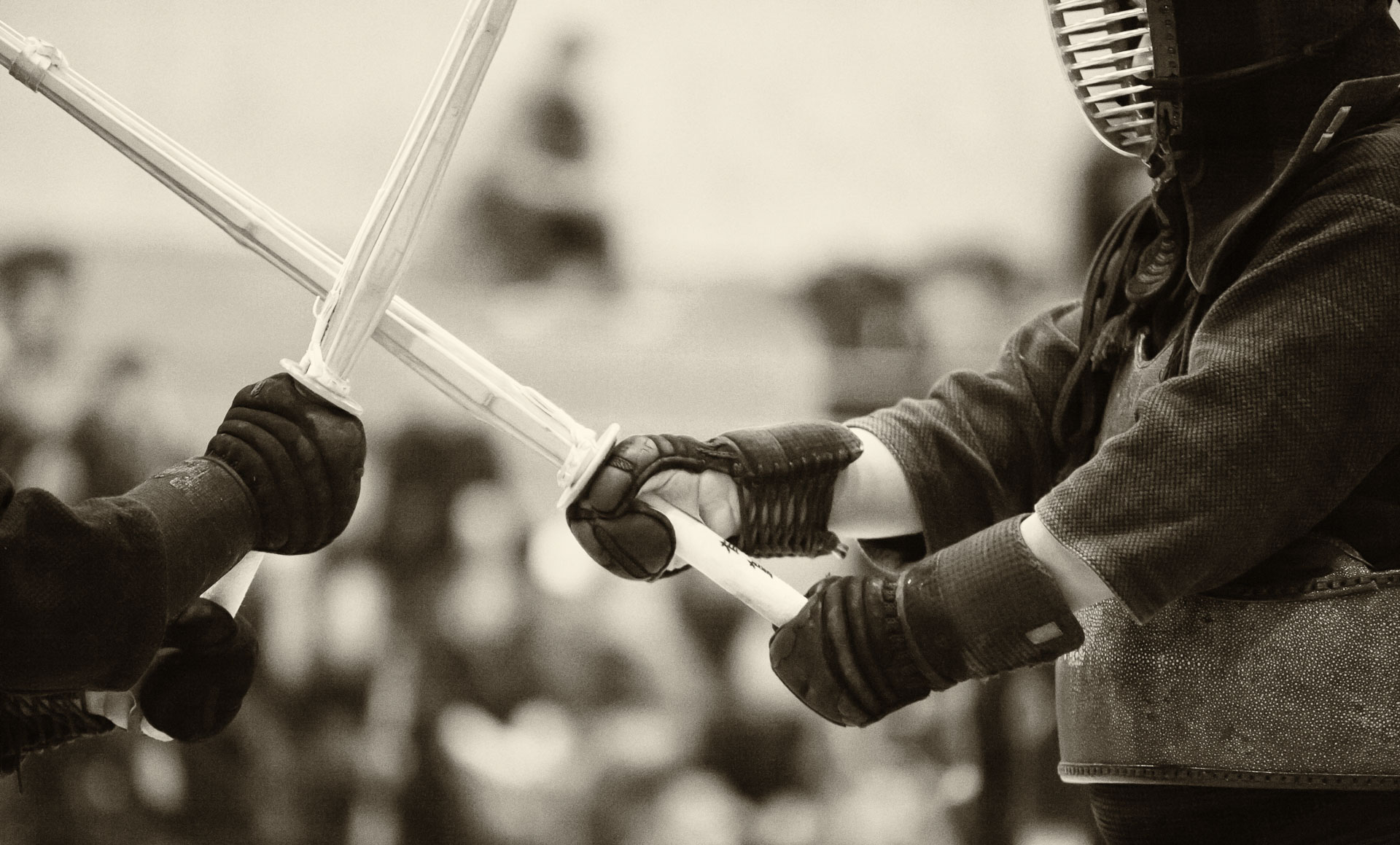
Swords and pencils

“It is said the warrior’s is the twofold Way of pen and sword, and he should have a taste for both Ways.”
Miyamoto Musashi

DSC07219_05-06-2017

A katana, or any Japanese-style blade for that matter (as well as some Middle-eastern blades like in the image above), is similar to a pencil in terms of the principle of its physical construction.

Both a blade and a pencil have hard materials at their core (a katana can have many layers of different hardness, but the general principle is to have a hard metal surrounded by a softer one). For the pencil, it’s the graphite, and for the katana, it’s the steel with high carbon content. For both instruments, the hard core forms the working part, which can be sharpened to a fine point/edge.

DSC05279-2_01-30-2017

The hard core is enclosed in a relatively soft material – wood in the case of the pencil and low-carbon steel in the case of the sword. Without the outer set shell, neither instrument would be practical to use, because the core it too brittle to withstand the pressure of the artist’s hand or a strike of an enemy’s sword. Likewise, a soft, mono-layered instrument without a core would be a compromise at best in terms of cutting/drawing quality. Think about a bronze sword or a crayon – neither is particularly strong, and neither can be sharpened to a fine point or edge.

DSC06834_04-29-2017

A pencil that we use today is a European invention. Hand-carved wooden holders with graphite core were first made in England in 1564, and a Czech company Kohinoor patented and mass-produced pencils that were very similar to modern ones in the 19th century.

Europeans also made multi-layered blades, but the technique was refined and taken to the level of an art in Japan in middle ages.

I find it curios how these tools from two unrelated fields of application (cutting and writing) evolved along similar design paths, because in both fields similar qualities are valued – sturdiness and ability to be sharpened.

DSC07216_05-06-2017

Designing a logo

IMG_0011

Brainstorming ideas for our new magazine’s logo (which needs to incorporate letters “B” and “L”) is a new experience for me. Being outside of my comfort zone, I am forced to go way back to basics and research the fundamental principles of logo design. Here are some basic concepts of what make a good logo.

A company logo is intended to convey a distinctive identity, but achieving this on something that would be printed on something as small as a postage stamp or as large as a billboard is not trivial. Perhaps, it is not surprising that distilling the principles of a good logo design to a concrete recipe is challenging. After all if it would be easy, everyone wold be a great logo designer. Still, some basic principles can be discerned by studying the common features of famous logos.

Perhaps, the most important attribute is simplicity. Being simple achieves two objectives: it has a potential of being effective (i.e. visually appealing) regardless of size and it can be easily recognizable.

Another important property is versatility. A good logo should be recognizable and effective when printed in one colour or in inverted tones, for example. Many designers suggest starting the process of designing a logo in back and white only. Doing so allows one to concentrate on the concept and to express it in a shape, rather than relying on colour, perception of which is inherently subjective.

Here are some early sketches of mine – exploring the smooth and edgy curves…

IMG_0013