
I think that, ultimately, what makes an image (photograph or painting) visually appealing is contrast. There are many types of contrast: large and small objects in the composition, empty and filled spaces, dark and light areas (the actual contrast in the photographic terms), warm and cool colours, contrasting colours (e.g. red/green, orange/violet), etc. A skillful artist uses contrast to create an exciting image, and when a dilletant by chance snaps a photo with great impact, it usually prominently features one or more types of contrast.
Perhaps, what makes us like the contrast is our inherent striving for balance. When we are viewing a high-contrast image, we are being taken on a roller coaster ride along the range of hues and grayscale values, and we find the sensation of the loss of control entertaining.

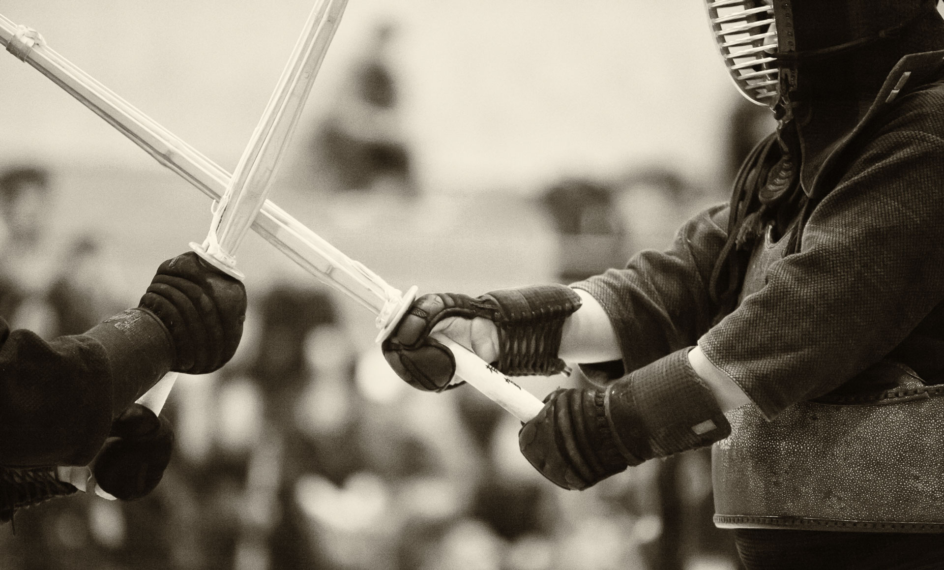
Actually, human tendency to strive for balance is routinely exploited in martial arts, such as aikido or kendo, because when we are taken off-balance, we tend to automatically (i. e. spontaneously and unconsciously) over-compensate and put ourselves in a precarious position. Also, contrast between periods of calm and explosive motion wakes the fight exciting and interesting to watch. On a somewhat deeper level, when a kendo technique, for instance, posesses a quality of contrast it looks appealing to the judges (shinpan). For example, striking a high target, such as men, from a low shinai position (geidan no kamae) is inherently interesting, and such contrast (low/high) in technique has been known to attract recognition in tournaments.
